Lab 6
Pre-Reading Quiz
Please fill out the pre-reading quiz on Canvas at the beginning of class!
Learning Objectives
- Know how to link multiple views with each other
- Understand the concept behind D3’s brush component
- Understand the JS keyword this and the scope of execution
- Get a better understanding of system design and code structure
Prerequisites
- You have read and programmed along with:
- http://www.cs171.org/2018/assets/material/cs171-lab6-reading.pdf
- The four chapters about JS objects at http://www.w3schools.com/js/js_object_definition.asp (repetition of JS objects with more examples)
- [Optional] Scope and this in JavaScript
In the last weeks you have learned the fundamentals of the JS library D3 and you have gained some implementation expertise during previous labs and homeworks. You should be comfortable with the major concepts and be able to implement common charts as well as interactive and more advanced visualizations with D3.
In this lab you will work on a new problem set. It is continuous, a bit longer than the usual activities, and it will give you a better understanding of linked views and system design.
We will provide a template and many additional code snippets so that your main tasks will focus on the structure and the event handling components. However, please make sure that you understand the code in the provided templates, and take your time to read through it!
Data
Purchases for Household Supplies in the UK
In this lab you will work with a dataset that contains detailed annual statistics on family food and drink purchases in the UK.
We have already extracted the major information and created a JSON file with data between 1974 and 2013.
The JSON file is divided into two major arrays with objects:
yearscontain the average weekly spending on food and drinks in pence (GBX) per personlayersalso contain the average weekly spending, but separated into 21 different food categories
JSON Structure:
{
	"years": [
		{ "Year": 1974, "Expenditures": 331.437 },
		...
		{ "Year": 2013, "Expenditures": 2986.373 }
	],
	"layers": [
		{
			"Year": 1974,
			"Milk and milk products excluding cheese": 29.228,
			"Cheese": 8.694,
			"Carcase meat": 44.479,
			"Non-carcase meat and meat products": 55.915,
			"Fish": 13.652,
			"Eggs": 11.429,
			"Fats": 14.537,
			....
		},
		{
			"Year": 1975,
			"Milk and milk products excluding cheese": 37.239,
			"Cheese": 10.377,
			...
		},
		...
	]
}
The data is part of the annual Family Food Report, it is published through UK’s open government platform gov.uk and is updated every year. However, the dataset is not completely accurate and there is a lack of data in some areas. For example, alcoholic and soft drink figures appear for the first time in 1992, but we can assume that people have consumed these products before.
Source: https://www.gov.uk/government/statistical-data-sets/family-food-datasets
Template
This lab will bring you a step closer to implementing more complex visualizations which makes it necessary to adapt the way how we organize our application. However, the provided template is quite similar to previous labs and homeworks. It is based on Bootstrap and it contains a basic HTML structure, some CSS rules and pieces of JS code.
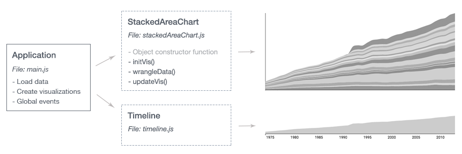
During this lab we will introduce a concept which will help you to structure a D3 project with multiple visualizations. For this reason, we will also describe the file structure in more detail. The main change is that each visualization is a separate JS object and the implementation of the different visualizations is moved into separate JS files.
Preview
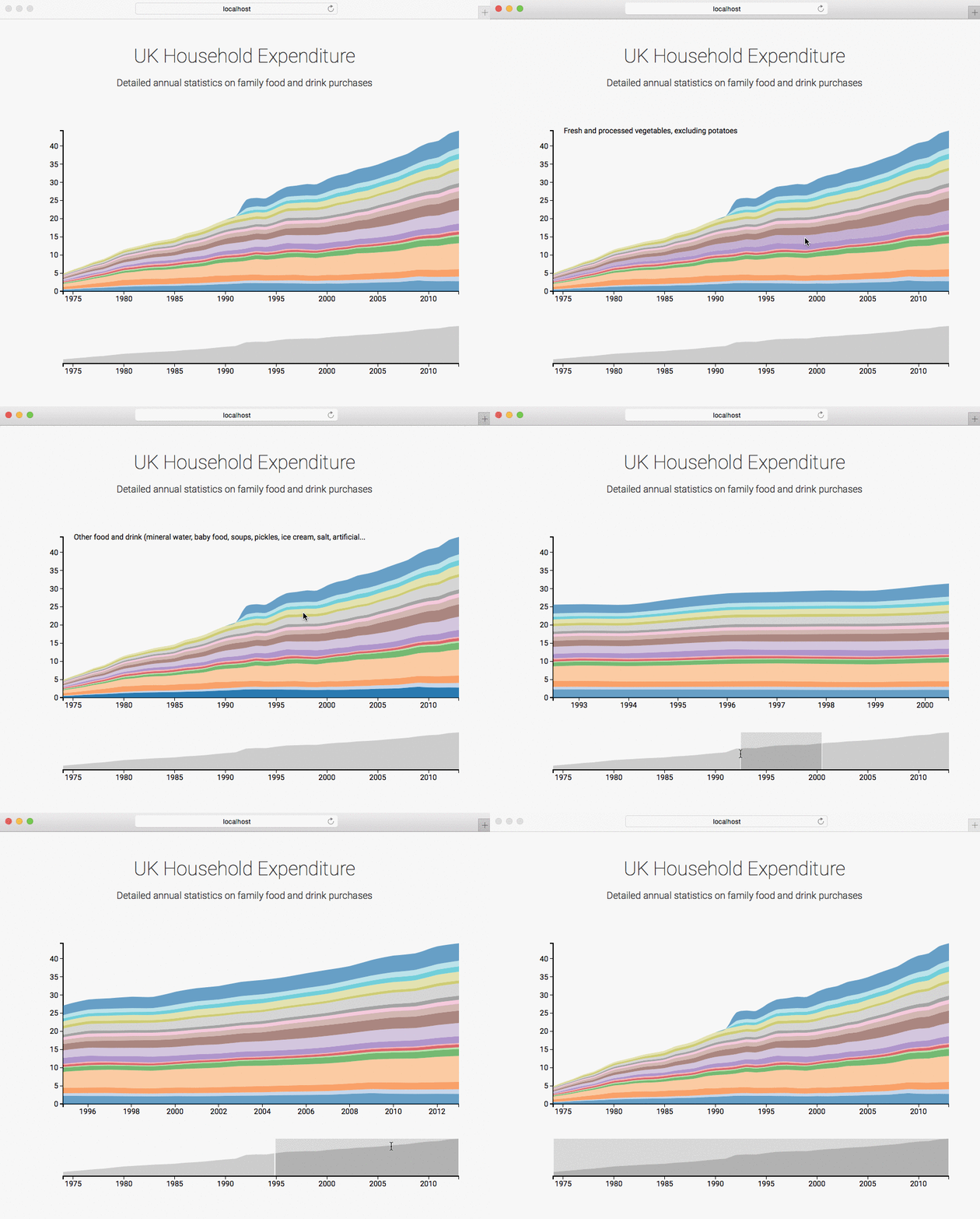
After implementing all tasks your visualization should look like this:

Conceptual and technical background
Thinking about the structure of your project early on can save you a lot of time and will make your implementation more robust, extensible and reusable.
Files and folders
The provided template is structured as follows:
- index.html is the default file that appears when a user invokes your webpage. It should include a basic structure and placeholders for your visualizations.
- /js contains the JS files for the visualization and external libraries (can be further sub-divided)
- /data contains the data files
- /css contains the stylesheet files
Divide and conquer
You should always try to split a complex problem into smaller, easier-to-tackle sub-problems. Each sub-problem will be solved independently and afterwards integrated into the final system.
Visualizations should be organized and structured into individual code components and, if possible, implemented as flexible and reusable components. Therefore, we will organize each visualization as an object.
The visualization specific implementation should be done in object functions and should follow this pipeline:

Visualizations as objects
The following example will give you a better understanding of these steps.
We can create an instance of an object by using the keyword new. The object constructor should be used to define properties:
// Create an object instance
var barchart = new BarChart("bar-chart-container", data);
We can define properties within an object by using the keyword this:
// Object constructor function
BarChart = function(_parentElement, _data){
	this.parentElement = _parentElement;
	this.data = _data;

	// Call an object function
	this.initVis();
}
We will implement methods as Object.prototype properties:
BarChart.prototype.initVis = function(){
	...
}
Object.prototype
- All JavaScript objects inherit their properties and methods from their prototype
- The methods are in the execution context of the object
- The object property
prototypeallows you to add new properties/methods to an existing prototype
The variables should be stored in the visualization object by using the this keyword. We would recommend to create another variable (for example vis or _this) to store the this-accessor. Otherwise the scope of this will change and it will cause undesirable side-effects:
BarChart.prototype.initVis = function(){
	var vis = this;

	vis.margin = { top: 20, right: 0, bottom: 60, left: 60 };

	vis.width = 800 - vis.margin.left - vis.margin.right,
  	vis.height = 400 - vis.margin.top - vis.margin.bottom;

  	vis.svg = d3.select("#" + vis.parentElement).append("svg")
		.attr("width", vis.width + vis.margin.left + vis.margin.right)
		...
}
At the end of initVis() we call the function wrangleData() to follow our implementation pipeline:
BarChart.prototype.initVis = function(){
	...

	vis.wrangleData();
}
It is quite usual that you have to process and prepare data (filter, aggregate, …) for a visualization whenever the data changes or after a user interaction. The function wrangleData() should take the raw data and modify it in a way that it can be mapped to the screen afterwards (updateVis()):
BarChart.prototype.wrangleData = function(){
	var vis = this;

	// Filter example
	vis.displayData = vis.data.filter(function(d){
		return d.year > 2000;
	});

	// Draw visualization
	vis.updateVis();
}
You should already be familiar with the last part. The function updateVis() contains the D3 update pattern (enter, update, exit). We use the variable displayData that we have created in wrangleData() before:
BarChart.prototype.updateVis = function(){
	var vis = this;

	// Update domains
	vis.y.domain([0, d3.max(vis.displayData, function(d) { return d.price; })]);
	...

	// Draw the actual bar chart
	var bar = svg.selectAll(".bar")
      .data(data);

	bar.enter().append("rect")
		.attr("class", "bar")
		...
}
Project overview
The previous example showed the implementation of a bar chart in an object-oriented way. To follow the main divide-and-conquer concept (i.e., splitting up a complex problem into various sub-tasks) we should also apply this to the file structure of our project.

We separate the visualization specific code into external files and create object instances in the file main.js, which is the entry point of our application. For example, if we want to use the same data for multiple charts we have to load the data only once in main.js. Thereby, our code stays clean and understandable.
This methodology will become very helpful for developing larger systems and more sophisticated interaction mechanisms.
Implementation
Activity I - Load data and create an instance of the stacked area chart
For all implementation parts in this lab, you should keep in mind that visualizations are implemented as objects. So if you want to store variables that belong to the visualization, make sure that you store it in the correct context (e.g., vis.my_variable). The same goes for accessing object parameters. If you get an error that a variable is undefined, make sure that you access it correctly!
For simplicity reasons, in the example code below, we have not always included the object oriented way of accessing variables - you will have to adjust that code to your overall code structure.
-
Download the template
http://www.cs171.org/2018/assets/scripts/lab6/template.zip
Check the
index.htmlfile and get a quick overview of the template.- The file
js/main.jsis the entry point of our application. It contains general scripts (e.g., loading the data) and it should create instances of the visualizations - The file
js/stackedAreaChart.jscontains the specific implementation of the stacked area chart (see bar chart example above)
The data loading script is already complete and we have also created the file stackedAreaChart.js with boilerplate code.
- The file
-
Create an instance of
StackedAreaChartAfter the data is loaded completely, the function
createVis()in main.js is getting called. We will use this function to create instances of the visualizations.→ Create an instance of
StackedAreaChartand use the constructor to specify the properties: parentElement (“stacked-area-chart”) and data (“allData.layers”).→ Open the webpage in your browser! If everything worked, you should see the loaded data in the web console and an SVG area with placeholders for the axes in the web inspector. If you get an error message in the web console you should fix it before going further.
Stack Shape
As you have seen in the preview at the beginning of this lab, you have to create a stacked area chart to visualize the different categories of UK’s household expenditures. Instead of calculating the coordinates of these layers manually you can use d3.stack() to generate a baseline value for each datum, so you can “stack” layers of data on top of each other.
And as a reminder from the previous lab: The D3 shape methods have no direct visual output. They take data that you provide and re-map or otherwise transform it, thereby generating new data that is more convenient for a specific task.
Example:
// Example data
var data = [
                {
                    "Milk": 10, "Water": 4, "Year": 2015
                },
                {
                    "Milk": 12, "Water": 6, "Year": 2016
                },
                {
                    "Milk": 11, "Water": 7, "Year": 2017
                }
            ];

// Initialize shape function specifying keys
var stack = d3.stack()
	.keys(["Milk", "Water"]);

// Call shape function on the dataset
var stackedData = stack(data);

console.log(stackedData);
Have a look at the console output. The resulting stacked data is now an array with two values, with each value an array itself corresponding to each category: “Milk”, and “Water”. Each entry in a category array provides two numerical values and the associated data object(series[0][0].data). The numerical values correspond to the baseline value, and the topline values respectively. For example, the first entry for “Milk” is series[0][0] where series[0][0][0] is the baseline and series[0][0][1] is the topline. Notice that the baseline value is equal to the sum of all the y values in the preceding categories. The category “Milk” is our first category and starts at the bottom, which means that the baseline values are zero.
Stacked Area
To stack these categories visually, we can create stacked bar charts or stacked area charts. In this lab you will create a stacked area chart. But it should be easy to adopt the workflow to a bar chart.
You have already created an area chart (see HW4 - Za’atari Refugee Camp) and a line chart (see HW5 - FIFA World Cup) and you should know how to use the D3 path generator. The built-in d3.area() is ideally suited for the stacked area chart too. It just needs some slight modifications of the y0() and y1() parameters to consider the different baselines:
// Basic: area
var areaBasic = d3.area()
	.curve(d3.curveCardinal)
	.x(function(d) { return x(d.data.Year); })
	.y0(height)
	.y1(function(d) { return y(d[1]-d[0]); });

// Extended: stacked area
var areaExtended = d3.area()
	.curve(d3.curveCardinal)
	.x(function(d) { return x(d.data.Year); })
	.y0(function(d) { return y(d[0]); })
	.y1(function(d) { return y(d[1]); });
The d3.curveCardinal interpolation curve is optional and can be used to create smooth shapes.
Activity II - Create a stacked area chart
The file stackedAreaChart.js contains some functions with code snippets (append SVG, initialize scales and axes, etc). Try to get a quick overview and extend the implementation by running trough the following steps:
-
Stack the data
This task should be done only once, so we would recommend an implementation in the
initVis()function. If you want to filter the data, you can do this afterwards in thewrangleData()function directly on the “stacked” data.D3 Wiki: https://github.com/d3/d3-shape/blob/master/README.md#stacks
You will need the list of categories to serve as keys for the stack function. Therefore, our first step is to get the categories:
-
Get all categories
You can reuse
colorScale.domain()to get all category names. In the file main.js, after the initial data preparation, we have used d3.keys to set the domain of the color scale. Take a look at that part in the code in main.js to make sure you understand what is going on, before getting the categories ininitVis()as shown below.var dataCategories = colorScale.domain(); stack = d3.stack() .keys(dataCategories); -
Stack the data
After initializing a D3 stack layout you can call it on the dataset:
var stackedData = stack(data);
-
-
Initialize the D3 path generator in
initVis()After transforming the data into layers you have to initialize a path generator which maps the actual values to screen coordinates. The
updateVis()function will use it later to draw the chart.Make sure to save the path generator in the variable
area:vis.area = d3.area() ... -
Call the
wrangleData()function and draw the chartThis function will be used to filter/aggregate the dataset every time the visualization is rendered. Therefore, remove the comment and call wrangleData() at the end of the initVis() function. This will automatically call updateVis(). You will have to extend wrangleData() later.
We have already implemented a basic version of the
updateVis()function for you. It will update the y-axis domain, create visual elements for the stacked layers by using your path generator and finally update the axis labels.If you have completed the above implementation steps correctly, you should see the stacked area chart in your browser.
Otherwise, debug your code and make sure that the data preparation (stacked data) and the path generator (
vis.area) is working as required.
Focus+Context via Brushing
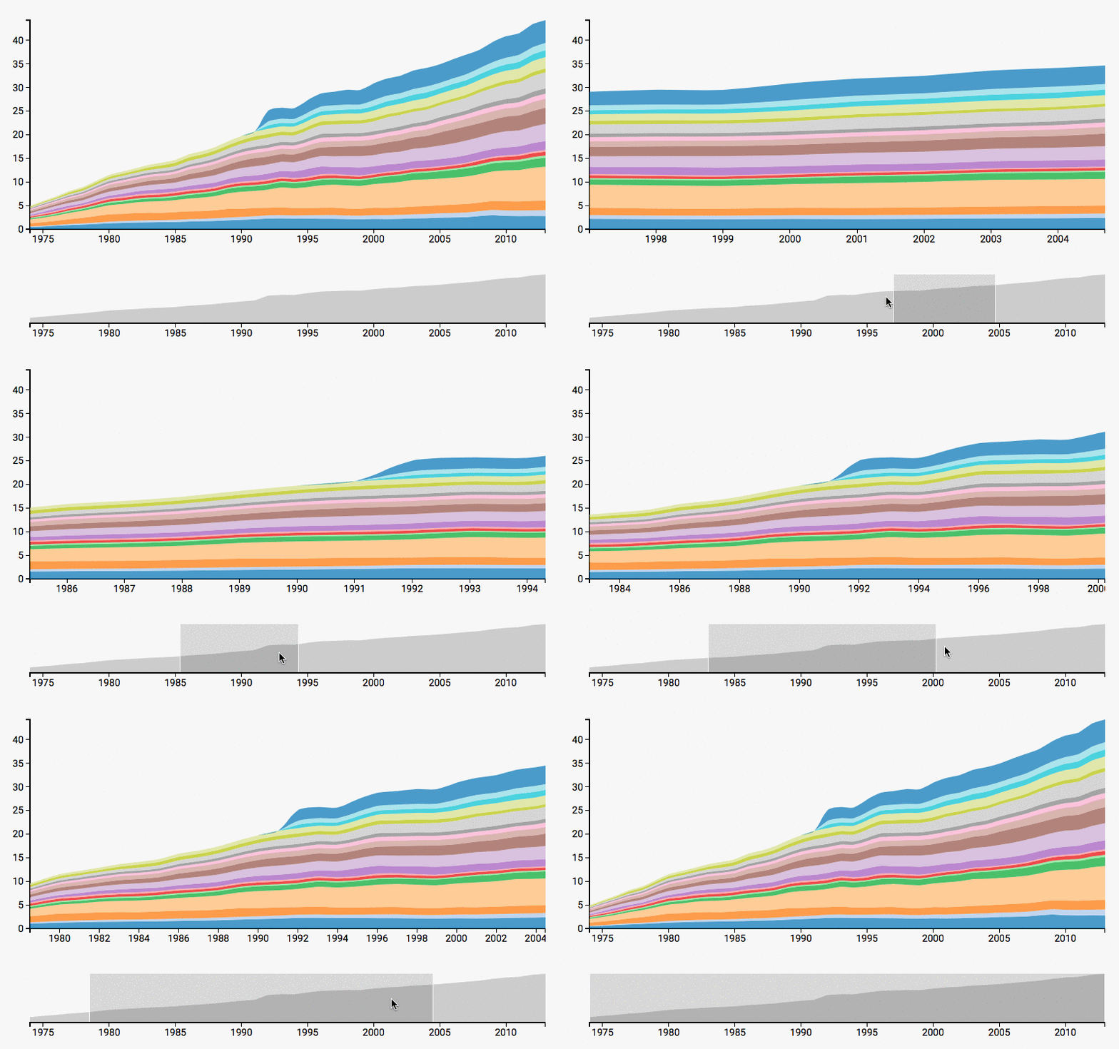
In the next task you will extend the visualization with a second chart (a basic area chart; see Preview), to give the user the possibility to zoom and to select a specific time range.
Focus+Context
- The stacked area chart should show selected regions in greater detail (focus)
- The basic area chart preserves a global view at reduced detail without layers (context)
This technique allows us to show the user detailed information linked with an overview (context) simultaneously.
Brushing & Linking
The idea of brushing is to allow the user to select a subset of data interactively. In combination with linking - changes are automatically reflected in linked visualizations - you can get the desired focus+context visualization.

Brushing with D3
D3 Wiki: https://github.com/d3/d3-brush/blob/master/README.md
There are three types of brushes in D3 for brushing along the x, y dimensions, or both: d3.brushX, d3.brushY, and d3.brush. Each brush defines a selection in screen coordinates. The brushable area is specified via brush.extent().
The property on must be used to set an event listener, whereby you can choose between three different events:
brushstart- on mousedownbrush- on mousemove, if the brush extent has changedbrushend- on mouseup
// Initialize time scale (x-axis)
var xScale = d3.scaleTime()
	.range([0, width])
	.domain(d3.extent(displayData, function(d) { return d.Year; }));

// Initialize brush component
var brush = d3.brushX()
    .extent([[0, 0], [vis.width, vis.height]])
    .on("brush", brushed);
We can react to the event and update the linked visualizations in a separate function. Particularly noteworthy is the function d3.brushSelection(node) which returns the current brush extent or in other words, it returns the user’s selection.
function brushed() {
	// Get the extent of the current brush
	var selectionRange = d3.brushSelection(d3.select(".brush").node());

	// Convert the extent into the corresponding domain values
	var selectionDomain = selectionRange.map(xScale.invert);

	// Update focus chart (detailed information)
	...
}
Note that we used d3.select(".brush").node() to specify which node’s selection we want via a class attribute brush. In the last step it is necessary to append the brush to the context chart with the class attribute. This step is also comparable to appending a D3 axis. An additional rectangle, within the SVG group element, should indicate the current selection for the user:
// Append brush component
svg.append("g")
      .attr("class", "x brush")
      .call(brush)
    .selectAll("rect")
      .attr("y", -6)
      .attr("height", height + 7);
Activity III - Implement Focus+Context
In the next activity you will have to implement a second chart with an interactive brushing component. Most of the parts are already complete but you have to connect the components to each other.
-
Create an instace of
TimelineThe result of this lab should be a stacked area chart (focus) linked with a basic area chart (context). To avoid confusion, we will call the basic area chart from now on “timeline” because it shows the full time period.
You can find the implementation of the timeline in
js/timeline.js. The self-contained component follows our methodology and can be easily integrated into the system.→ Open
timeline.jsand get an overview of the implementation. It is much shorter than the stacked area chart because the area path and the axis is static and we don’t need any data wrangling tasks.→ Create an instance of
Timelineand use the constructor to specify the properties (see constructor function intimeline.js). The timeline should not include the detailed layers of our data, but it should indicate the general trend. Therefore, the dataallData.yearsis perfectly suited.↻ Reload the webpage in your browser. If you have created the instance correctly you should see the timeline below your stacked area chart. Otherwise make sure that you have included the right parameters (container ID, data).
-
Implement the brushing component
You have to extend the timeline and implement the described focus+context approach for the visualization. The prior brushing example should help you to include the necessary pieces of code.
→ Initialize the brushing component in the
initVis()function→ Create a global function
brushedin main.js-
The implementation in this file acts as a controller and can access both charts. Alternatively, and more important for larger systems, you can include a more sophisticated event handling mechanism. But for this example it is enough to create a global function and link the two visualizations directly.
The way we do this is a pre-stage. You will learn more about event handling and system design in lab 8.
-
Update the x domain of the stacked area chart every time the brushed event gets triggered. And don’t forget to update the chart by calling:
areachart.wrangleData();
→ Append the brush component to the timeline SVG
↻ Reload the webpage in your browser. You should be able to choose a specific time period in the timeline (context) and the stacked area chart (focus) will automatically zoom in and will show the details for the selected years.
But now there is probably an error in the stacked area chart. When you zoom in, the layers will expand and go beyond the y-axis until they reach the end of the SVG container. You should solve the problem by using a rectangle as an overlay and clipping the path:
Paste this code snippet after creating the SVG element:
vis.svg.append("defs").append("clipPath") .attr("id", "clip") .append("rect") .attr("width", vis.width) .attr("height", vis.height); -
Activity IV - Implement basic tooltips
Currently it is not possible to identify layers and to get detailed information for a specific year. All of this would require an advanced tooltip solution.
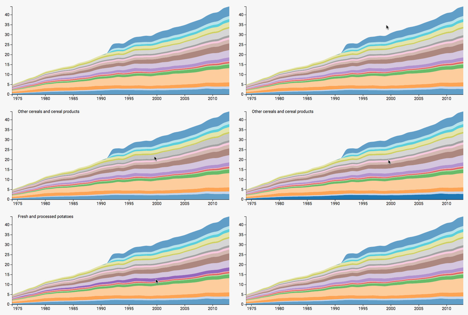
You will implement a lightweight version of these tooltips which should help the user to identify just the category names.
-
Append a tooltip placeholder
Open
stackedAreaChart.jsand append an empty SVG text element. This element should be created only once. It should be used as a placeholder for the category names and should get updated every time the user hovers over a layer.Feel free to choose proper coordinates. In the preview the label is positioned in the top left corner of the stacked area chart.
-
Update the tooltip
Create a mouse listener for the SVG path (layer of stacked area chart, in
updateVis()) and update thetextproperty of the tooltip-element every time the user hovers over it.
Bonus Activity (optional) - Show details for a specific layer
Due to the stacked layout it is sometimes difficult to see the exact evolution of a specific layer. An extension which allows the user to click on a category in order to see the details would solve this problem.

You should implement:
- A variable
filterthat stores the current category (if nothing is selected, the filter variable should be empty) -
A click listener for the layers (in addition to the previous mouse hover listener) that triggers the update of the stacked area chart. If the user clicks on the same category again the visualization should jump back to its default state.
Example for a click listener with toggle feature:
.on("click", function(d,i) { vis.filter = (vis.filter) ? "" : dataCategories[i]; vis.wrangleData(); }) -
A second path generator d3.area() in
initVis()for displaying a single layer. You can go to timeline.js to see the path generator for a basic SVG area. (Basically this whole feature you are implementing is just a switch between the stacked area chart and a basic area chart. ) -
An extension of the function
wrangleData(). If the user selects a specific layer the display data should be filtered:var indexOfFilter = dataCategories.findIndex(function(d){return d == vis.filter}); vis.displayData = [vis.stackedData[indexOfFilteredCategory]];Make sure you add an IF statment and update
vis.displayDataaccordingly. -
An extension of the “domain update” for the y-scale (in
updateVis(). If you want to display a typical area chart without layers you have a fixed baseline at zero and don’t need to consider the y0 parameter..vis.y.domain([0, d3.max(vis.displayData, function(d) { return d3.max(d, function(e) { if(vis.filter) ... else return e[1]; }); }) ]); -
An IF statement in the update section to switch between the simple path generator (area) and the advanced path generator (stacked area) depending on whether the user has selected a category (in
updateVis()):.attr("d", function(d) { if(vis.filter) return ... else return vis.area(d); })
Great job, you now have a focus-and-context visualization that even allows you to get details on individually selected categories!
Submission of lab (activity I - IV)
Congratulations, you have now completed the activities of Lab 6!
Please submit the code of your completed lab (the final focus-and-context visualization you created in activities I-IV) as usual.
Resources
- p. 273-281 in D3 - Interactive Data Visualization for the Web by Scott Murray
- http://javascriptplayground.com/blog/2012/04/javascript-variable-scope-this/
- https://developer.mozilla.org/en-US/docs/Web/JavaScript/Introduction_to_Object-Oriented_JavaScript
- http://www.w3schools.com/js/default.asp