Hall of Fame
Best Projects 2015
These are the best projects (out of 76 in total) in 2015. Within the sections the order is alphabetical.
Winners
This year we had two winners, with an exactly equal number of votes by the staff:
Datahub
Dayne Davis, Niamh Durfee, Alexandra Smith
New York City Schools
Aasta Frascati-Robinson
Runner Ups
The Growth of a Nation
Lauren Wood
CityCyle
Mirhee Kim, Emily Lovett, Michelle Danoff
Metro Boston Food Exploration
Christian Schlubach, Jack Birger, Sarah Ting
Ventures
Guillaume Laliberte
Visualizing Crime in Chicago: 2001-present
Zachary Fogelson, Alexander Jaffe
Visualizing Inundation Impacts
Michael Dowd
Behind Bars: A Visual Story
Hugh Zabriskie, Cynthia Meng
Carbon Emissions: A Global and Historical Perspective
Anna Zhong, Rachael Smith
hydro[CROP]monitor
Spyridon Ampanavos, Tiffany Cheng
Multi PheWAS Viewer
Antoine Neuraz
The Rent Is Too Damn High
Bartsch Elliott, Lo John, Perez Alejandro
Weather and the MBTA
Aaron Zampaglione, Filip Piasevoli, David Brown
Best Projects 2014
These are the best projects (out of 79 in total) in 2014. Within the sections the order is alphabetical.
Winner
Century of Corn
Benjamin Cook, Charles Hornbaker, Conor Myhrvold, Ryan King.
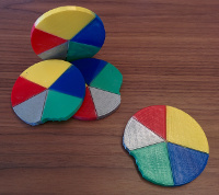
The prize for our winners: a 3D pie chart! We took a bite though!
Runner Ups Places 2-3
Data Driven Dota
Robbie Gibson, Benjy Levin, Huihui Fan
Fukushima Memoriam (Japan’s Triple Disaster)
Molly Lloyd, Anthony Thul, Eric Coletti
Runner Ups
Box Office Success and Social Media
Christopher Leuer
Exploring Influence and Bipartisanship through Social Networks in Congress
Jonathan Marks
Eye to the Sky. Chandra Edition.
Pat O’Brien, Katherine Wyman, Daniel Schultz
Not Safe Anymore (NSA)
Shreyas Dube, Christopher Gerber
owlhub. Insights
Arne Zeising, Hendrik Makait, Keda Che
SEAS
Rebecca Mazur
The Evolution of Social Networks
Andrew Reece, Brian Feeny, Jennifer Sulkow
Vindolanda: A Visual History
Nikhil Mulani
Visualizing the Great Recession Through The United States from 2001 to 2011
Eric Slater, Luciano Arango, Monarch Wadia
U.S. College Data Comparison Tool
Jaemin Cheun, Ray Kim
Zap! Pow! Graph! or Holy Data, Batman!
Charles Bandes, Svetlana Nelson
Best Projects 2013
Project 3 - Interactive Data Visualization
Winner
Energy Visualizations With UMI
James Perakis
Runner Ups Places 2-3
Visualizing U.S. Foreign Trade Data from 1992 to 2012
Albert Young, Kevin Sun
Streaming through 1Channel.ch
Rob Acheson, Jeff Fontas
Runner Ups
Identification of Mutations that affect Protein Functions
John Mercer, Balaji Pandian
Project Cork
Jason Tucker, Mike Degen
MIT Residential Footprint
Chunglin Wen, Amy Yu
Yelp! You’re Eating the Last Piece!
Nida Naushad, Jessica Wu
Harvard Concentrations: A Story
Jerry Chang, Lucas Lin
Palace of Pop
Mimi Xu, Joe Feghali
To Bid or not to Bid
Andres Arslanian, Nico Tejera
The Origin Of Languages And Their Scripts
Tamar Rucham
Project 2 - Interactive Data Visualization
Top 3
Letters Space Distribution
Tamar Rucham
Top 250
Jeff Fontas, Rob Acheson
Visualizing Aid Data
Kevin Sun, Albert Young
Runner Ups
ABC Company Shipping Metrics
Christoper Allen
Kiva Lending Snapshot
Han Kim
Piazza Exploration: Exploring Activity in a Collaborative Academic Forum
Kristiana Laugen, Andrew Bocskocsky
Trends in Chicago Crime
Jeff Adams, Matt Lutze
US flight traffic in the face of major exogenous shock
David Chouinard, Vincent Tsugranes
Project 1 - Data Scraping and Analysis with Tableau
NFL Offensive Trends by Team and by Year
Randy Miller
Exploring the creation and editing of President Barack Obama’s Wikipedia page
Jonathan Yip
Global Education: The Facts You Never Knew
Bharathi Balasubramanyam
Watching Hockey Beyond the Ice
Johnathan Mercer
Endangered Animals
Kevin Mu
Inbox Visualizer
Andrew Bocskocsky