Homework_instructions

Week-08 | Homework

1) Visualizing Covid Data (10 points)
Data
-
covid_data_20 is an official csv file from HealthData.gov . The structure of the file is slightly more sophisticated than the ones you’ve seen so far. This file contains Covid data from the year 2020 and has been cleaned up be the CS171 staff. There are 13675 rows in the dataset. For each of the 53* states and other jurisdictions in the dataset, there are n= 258 rows in the csv file where n is the number of days the dataset contains. In short, the experts that prepared the dataset basically concatenated the state-timelines.
* Initially, the dataset listed ‘NY’ and ‘NYC’ separately. The clean dataset now contains 516 ‘NY’ rows as ‘NYC’ rows have been replaced by ‘NY’.
-
census_usa is another csv file that features the US state population totals. The data can be downloaded at the United States Census Bureau Website. All 52 states and other jurisdictions (i.e. the 50 states as well as the District of Columbia and Puerto Rico) and occupy exactly one row in this data set. In the columns, the total population for the respective states are listed. You have access to the population for all the years from 2010-2019.
-
covid_data_22 is the latest Covid data from
HealthData.gov. You don’t need to use this file in this homework. This is just for people who have some extra time on their hands and would like to play around with the latest Covid data. Since the dataset hasn’t been cleaned by the CS171 staff , you might encounter some minor bugs. Just by looking at summations in the data table for this data set, you can probably identify the issue(s) immediately.
Template & Scenario
This week, we’ll provide you with both a template as well as a scenario/story behind the template.
Scenario
You are a young aspiring data scientist with an expertise in data visualization. You decided recently to move to Thailand where you rented a small cabin by the sea in hopes to finally find some inspiration for your next ‘project’. It is almost noon, and you just sat down with your non-alcoholic, low-calorie mocktail to really get started with your day when, suddenly, your phone is ringing. It is, Helmuth Wiesel the CEO of HelthWizz, a company that develops single page applications in the healthcare sector. He tells you that he’s got your number from his friend and colleague Hanspeter Pfister. Wiesel is desperately looking for a data visualization expert with proficiency in the JavaScript library D3. Recently, his star senior developer Fraya Vogel has left his team, but Wiesel has promised to deliver a new Coronavirus dashboard to his client within a week**.
Template

Before Fraya left to pursue her dream to live off-grid in a lighthouse in Iceland, she finished some mayor parts of the projects. Most prominently, she created:
- a responsive html grid for all the components,
- a brush component (brushable timeline), which allows users to filter the dataset by dates, and
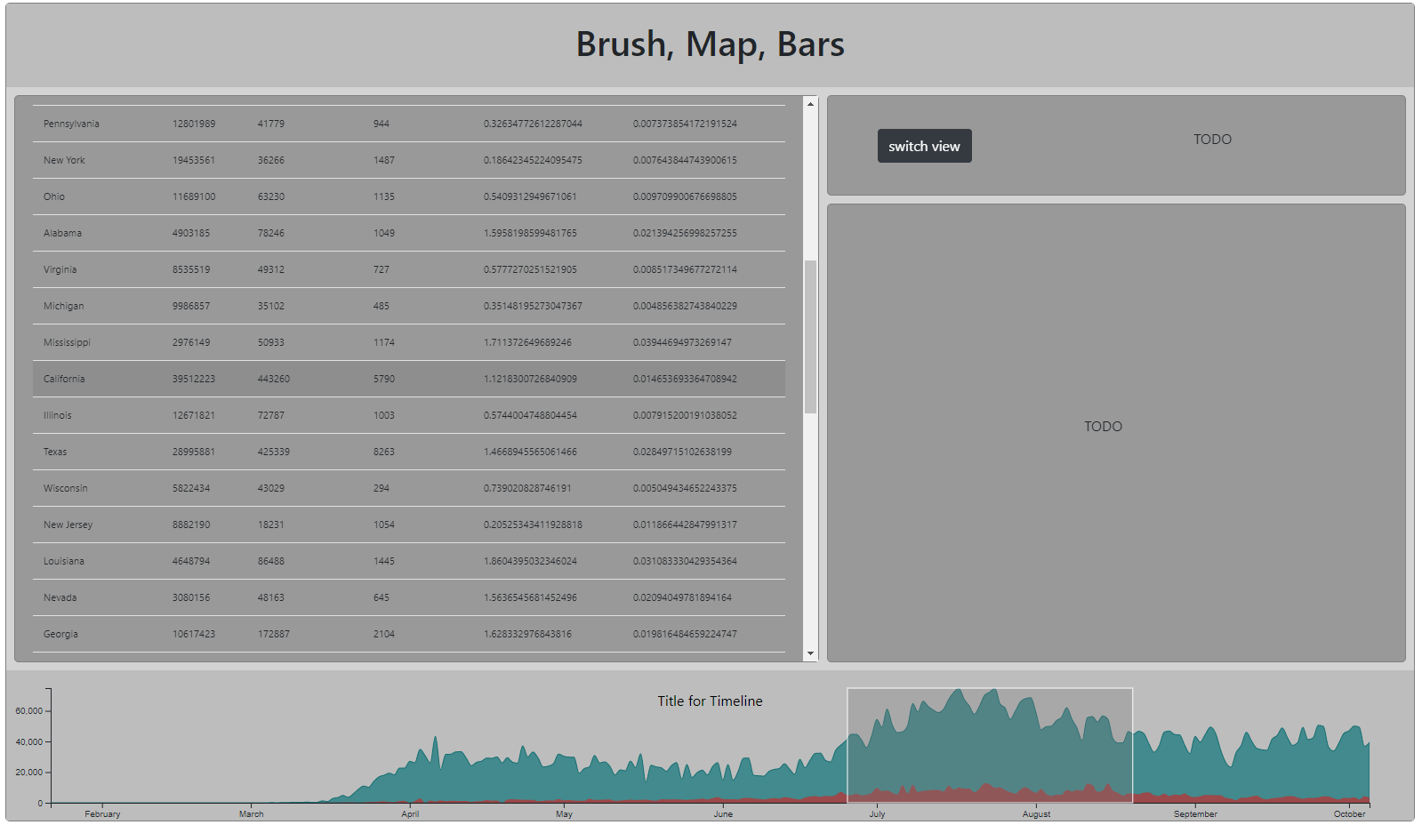
- a responsive table which updates on brush, listing all the US states & summaries (click ‘switch view ‘ to see it).
While the data wrangling algorithms Fraya wrote are very helpful, Helmuth Wiesel is unhappy with the ugly table. He is hoping that you could implement a choropleth map for him.
Having attended a D3 choropleth bootcamp recently, you think that you’re well-equipped for the task and agree to help Wiesel. He cries tears of happiness and sends you a .zip file with the code that Fraya has written so far.
Implementation
Overview
-
Download the resources
Download the template: Template.zip
-
Familiarize yourself with the provided framework and the dataset
Familiarize yourself with the datasets. Then, check out
main.jsand make sure to understand how we load the data. Then, examine the classesBrushVisandDataTable. We created two instances of these classes. How are they linked? Can you identify the code where the two link to one another? -
Write the class MapVis from scratch
(see Task: MapVis for more information)
-
Write class BarVis from scratch
(see Task: BarVis for more information)
-
Prettify
link views, add titles, axis, legends, hover effects, etc.
Tasks

Task MapVis
-
Create class MapVis
Check out dataTable.js and examine closely how the former developer has structured the code. Since your map is basically just a nicer way to display the data, the
class DataTableshould at least provide some inspiration and orientation. In terms of the code architecture and the class structure,DataTablecould even serve as blueprint for yourclass MapVis. Make sure that MapVis contains a comprehensiveconstructor()method with all the parameters needed as well as the pipeline methodsinitVis(),wrangleData(), andupdateVis()method. -
Define Constructor
As mentioned in #1, make sure to include all the data you need. In addition to the data included in
class DataTable, you will also need to account for geographical data. Also, make sure to start your pipeline in your constructor by calling theinitVis()method. -
Define initVis() method
Use the knowledge and insights you’ve accumulated over the past weeks and this week’s lab to set up a proper initVis() method. Include your margin conventions, title, tooltip, legend, and scales.
Hint: In order to draw a map, D3 basically just draws paths. The number of paths will not change with any kind of
updateVis()function because you will not change the number of countries in your selection. Thus, you can draw your map already ininitVis()and store the selection, i.e. all the states as a property. You can access that property, i.e. the selection, in other methods (e.g .updateVis()) and can simply change and update the fill attribute. -
Set up the map
In this homework, we ask you to draw a map of the US using D3. In this week’s lab, you’ve already created a world map using projections and a geo path generator to then draw the countries. When drawing the US state paths, there are a few geometries available that you can use. Check out this github repo and the documentation. Also, this is the link to the d3.geo() documentation that might come in handy for this task.
In short, there are two different routes you can choose: 1) you can use a geometry that has not been projected (e.g. ‘states-10m.json’), and you do the projection yourself and play around with
scaleandtransform(), and 2) alternatively, you can use a map that has already been projected (e.g. ‘states-albers-10m.json’) to a specific viewpoint (976 on 610) to then just do some basic math to create the perfect fit for your website. You’ve seen the code for projections in the lab, here’s the code for geometries that have been projected to exact viewpoints.vis.viewpoint = {'width': 975, 'height': 610}; vis.zoom = vis.width / vis.viewpoint.width; // adjust map position vis.map = vis.svg.append("g") // group will contain all state paths .attr("class", "states") .attr('transform', `scale(${vis.zoom} ${vis.zoom})`);You should now be able to draw all the states. Do so in initVis.
-
Define wrangleData() method
Check out how
wrangleData()was implemented forclass DataTable. Use it as a blueprint. Make sure to log all the data by the end ofwrangleData()to ensure that you have the data structures you need. -
Define updateVis() method
You should have your pipeline set up in such a way that
wrangleData()callsupdateVis(). As soon as the final COVID data structure has been prepared, you should grab the state paths and update their fill attribute. -
Add tooltip
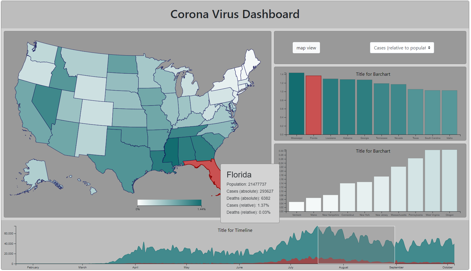
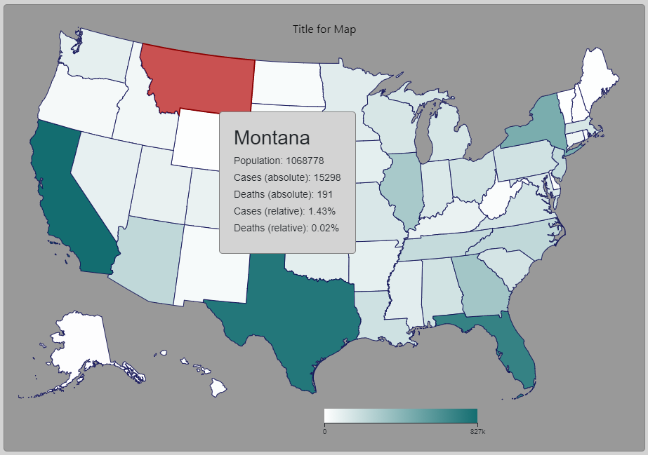
Just like you did in the lab, add a tooltip when you hover over a state and provide all information, i.e. absolute and relative covid cases and deaths.
-
Connect your map to the brush
On brush, call the
wrangleData()method of your MapVis instance. The map should update when you brush. -
Enable category selection via bootstrap select
Find a good place for a bootstrap select element in your html grid and add the following lines of code:
 <select id='categorySelector' class="custom-select align-self-center" style="width: 50%" onchange="categoryChange()">
     <option value="absCases" selected>Cases (absolute)</option>
     <option value="absDeaths">Deaths (absolute)</option>
     <option value="relCases">Cases (relative to population)</option>
     <option value="relDeaths">Deaths (relative to population)</option>
 </select>
Also, here’s some useful js that goes together with the HTML above.
 let selectedCategory =  document.getElementById('categorySelector').value;

 function categoryChange() {
    selectedCategory =  document.getElementById('categorySelector').value;
    myMapVis.wrangleData(); // maybe you need to change this slightly depending on the name of your MapVis instance
 }
Whenever you select a category, the map should now update.
-
Add legend to your map
Add a legend - you can utilize a continuous color scale or discrete color steps.

Task BarVis
-
Create class BarVis & create two instances
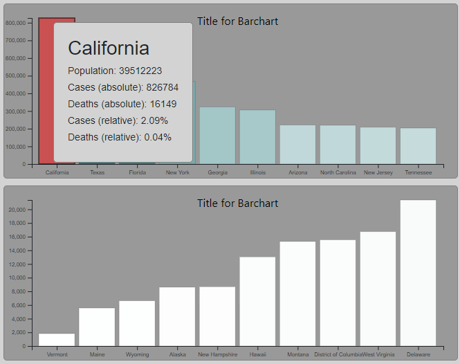
Besides the choropleth map, Helmuth Wiesel was also hoping that you could implement a class that takes care of creating bar charts so that you can include two instances of that class in the dashboard. Since you have plenty of bar chart code lying around on your computer from former projects, this shouldn’t be too hard. However, Wiesel has a special request : He wants one bar chart to show the top 10 states for a filtered category, and the other to show the lowest 10 states for that category.
-
Prepare class architecture and the constructor method
Set up your standard methods for your new class and define a constructor. Luckily, Fraya has already included some code as well as some comments. One thing she tried to solve was how to use only one class for both ascending and descending bar chart instances. She copied over her relevant wrangling code from the
DataTableand left some comments in thewrangleData()method about the reamining work.If you haven’t done so already, this is the time to create two instances of the
class
  BarVis
. The screenshot should give you an idea of where to position them. -
Complete initVis()
Thankfully, the margin conventions are already set up. Now, make sure you also set up your axis and scales before moving on to
wrangleData(). -
Complete wrangleData()
As mentioned above, there are some helpful comments at the bottom of the
wrangleData()method to help with the sorting and filtering of the data. The code already in thewrangleData()method is copy and pasted fromDataTable, so make sure you understand how it’s working in the Table first. -
Draw the bars and axis in updateVis()
Once you finished
wrangleData(), callupdateVis()and draw the bars. Use enter(), merge(), exit(). -
React to brushing and category change
As you’ve done already successfully for the map, have your bar charts react to the user input (brush and category selection). Also, make sure to include transitions!
-
Add a tooltip
Add a tooltip when hovering over a bar.
Final Remarks & Checklist:
-
Make sure your code is readable. New lines should logically reflect new blocks of code . Comment your code adequately.
-
There’s no need to prettify your project extensively. All CSS is given to you - Fraya has a ton of inline CSS, which on the one hand makes it easier for you to understand what’s going on , but at the same time results in quite a long and messy
index.htmlfile. This is totally fine for this submission, given that you’re working under great time pressure to deliver the dashboard. If you wanna impress Wiesel and the client, feel free to put it all in thestyles.cssfile and clean up the html. -
If you can’t get enough of this weeks hw, feel free to link the state in the map to the states in the bar charts visually. I.e. when hovering over a bar rect the according state path should be highlighted and vice versa. Using class names in a smart way might help you with that.
Submit Homework in Canvas
Use the following recommended folder structure & create a single .zip file:
/submission_week_08_FirstnameLastname
    hw/
        css/ 		...folder with all CSS files
        js/ 		...folder with all JavaScript files
        data/ 		...filder with all data for the project, e.g. csv files, etc.
        [potential other folders you might have used for the project, such as a fonts or an img folder]
        index.html

    lab/
        css/
        js/
        index.html

    class_activity/
    	[either pdf or link to gdrive that contains your running doc with class activities]
    	[latest Tableau workbook (either added here separately or within the gdrive)]
A few remarks based on some submissions we’ve seen:
- Please upload a single .zip file.
- Please make sure to name the root folder of your submitted project submission_week_05_FirstnameLastname. We’ll be starting to subtract points if you fail to do so because this will prevent us from automating the grading assignments.
- When grading your project, the grader expect your project to work when simply running your index file. This means all data as well as all other files you might have used need to be part of the project submission. If a grader needs to add any additional files, such as adding a data folder with the original .csv file, we’ll start subtracting points. The idea is that your submission is the equivalent of hosting the project on a live webserver that we’re visiting & evaluating.
Congratulations on finishing this week’s homework! See you in class!