
Lab 8
Pre-Reading Quiz
Please fill out the pre-reading quiz on Canvas at the beginning of class!
Learning Objectives
- Know how to create custom visualizations with D3
- Set up a completely new project without templates
- Consolidate the official documentation and external materials
- Apply the learned web development skills and your deep understanding of D3 to realize your own ideas and to implement unique visualizations (apart from bar and area charts)
Prerequisites
- You have read the section Creating a Unique Visualization of the article Custom Visualizations with D3.js: http://jsdatav.is/chap07.html#creating-a-unique-visualization. FYI - you might notice some unusual D3 syntax, because this article uses D3 version 3, while we use version 4.
Important Note: In this lab we want to guide you through creating a highly customized visualization in D3, without using typical building blocks like bar charts or line charts. That means that in this lab you will have to deal not just with writing correct D3 syntax, but also with figuring out in what way you can implement a certain feature. We give you pointers, but part of this lab is figuring these things out on your own. Do not hesitate to ask for help if you are stuck!
Visualization Goal: Padgett’s Florentines Families
In this problem set you will work primarily with network data. The data sources about marriage and business ties among Renaissance Florentine families were originally collected by Padgett [1] and then made available to the public. The dataset includes important families that were involved in a struggle for political control in Florence around 1430. With the collected data, researchers can analyze the influence of individual families and, in addition, can get a better understanding of the impact of these different kinds of relationships.
Each network consists of 16 families of the city of Florence in the early 15th century. In the graph, a family is represented as a node and marriages or business ties are the relations between these nodes. All the relations we consider are non-directional (symmetrical).
[1] Padgett, J.F. (1994): Marriage and Elite Structure in Renaissance Florence, 1282-1500. (http://home.uchicago.edu/~jpadgett/papers/unpublished/maelite.pdf)
Data
When we work with network data we usually distinguish between the matrix and the edgelist-format.
-
Edgelist: This is a simple way to represent a network as a basic list (e.g. csv file). Each row contains two IDs (vertex numbers) and defines one edge. If edges have weights, you can add a third column with the individual values. The advantage of using this format is that you can store additional edge information by appending more columns.
-
Adjacency matrix: If a graph has n vertices we can store the data in an n × n matrix. Data stored in this format is in many cases very convenient for the further processing in JS and D3. For example, we can query it easily with
graph[i][j]. The disadvantage of matrices is that they use a lot of space to represent only a few edges.
The data for this lab is stored in two adjacency matrices and a csv file which provides meta information:
-
Dataset: Meta data
florentine-family-attributes.csv- Family
- Wealth (each family’s net wealth in thousands of lira; in 1427)
- Priorates (seats on the civic council)
 "Family","Wealth","Priorates"
 "Acciaiuoli",10,53
 "Albizzi",36,65
 "Barbadori",55,NA
 "Bischeri",44,12
 ...
You will use the above dataset as a meta information for the networks. The family in the first row in the above dataset corresponds to the family in the first row and column of the adjacency matrices. The family in second row corresponds to the second row/column of the adjacency matrix, etc.
-
Adjacency matrix: Marriages
0,0,0,0,0,0,0,0,1,0,0,0,0,0,0,0
0,0,0,0,0,1,1,0,1,0,0,0,0,0,0,0
0,0,0,0,1,0,0,0,1,0,0,0,0,0,0,0
0,0,0,0,0,0,1,0,0,0,1,0,0,0,1,0
0,0,1,0,0,0,0,0,0,0,1,0,0,0,1,0
0,1,0,0,0,0,0,0,0,0,0,0,0,0,0,0
0,1,0,1,0,0,0,1,0,0,0,0,0,0,0,1
0,0,0,0,0,0,1,0,0,0,0,0,0,0,0,0
1,1,1,0,0,0,0,0,0,0,0,0,1,1,0,1
0,0,0,0,0,0,0,0,0,0,0,0,0,1,0,0
0,0,0,1,1,0,0,0,0,0,0,0,0,0,1,0
0,0,0,0,0,0,0,0,0,0,0,0,0,0,0,0
0,0,0,0,0,0,0,0,1,0,0,0,0,0,1,1
0,0,0,0,0,0,0,0,1,1,0,0,0,0,0,0
0,0,0,1,1,0,0,0,0,0,1,0,1,0,0,0
0,0,0,0,0,0,1,0,1,0,0,0,1,0,0,0 -
Adjacency matrix: Business Ties
0,0,0,0,0,0,0,0,0,0,0,0,0,0,0,0
0,0,0,0,0,0,0,0,0,0,0,0,0,0,0,0
0,0,0,0,1,1,0,0,1,0,1,0,0,0,0,0
0,0,0,0,0,0,1,1,0,0,1,0,0,0,0,0
0,0,1,0,0,0,0,1,0,0,1,0,0,0,0,0
0,0,1,0,0,0,0,0,1,0,0,0,0,0,0,0
0,0,0,1,0,0,0,1,0,0,0,0,0,0,0,0
0,0,0,1,1,0,1,0,0,0,1,0,0,0,0,0
0,0,1,0,0,1,0,0,0,1,0,0,0,1,0,1
0,0,0,0,0,0,0,0,1,0,0,0,0,0,0,0
0,0,1,1,1,0,0,1,0,0,0,0,0,0,0,0
0,0,0,0,0,0,0,0,0,0,0,0,0,0,0,0
0,0,0,0,0,0,0,0,0,0,0,0,0,0,0,0
0,0,0,0,0,0,0,0,1,0,0,0,0,0,0,0
0,0,0,0,0,0,0,0,0,0,0,0,0,0,0,0
0,0,0,0,0,0,0,0,1,0,0,0,0,0,0,0
Implementation
In contrast to all our previous labs we won’t give you a step-by-step instruction or template today. By working through the different examples of all previous labs and homeworks, you have constantly developed and improved your JS & D3 skillset. You now have all the knowledge and experience that is needed to solve this task independently. Therefore, we will just give you a description what we expect as a result. A few additional hints should help you to overcome certain hurdles.
Preview & Problem Description
In this lab you will build a custom visualization with D3 that will look like this one:
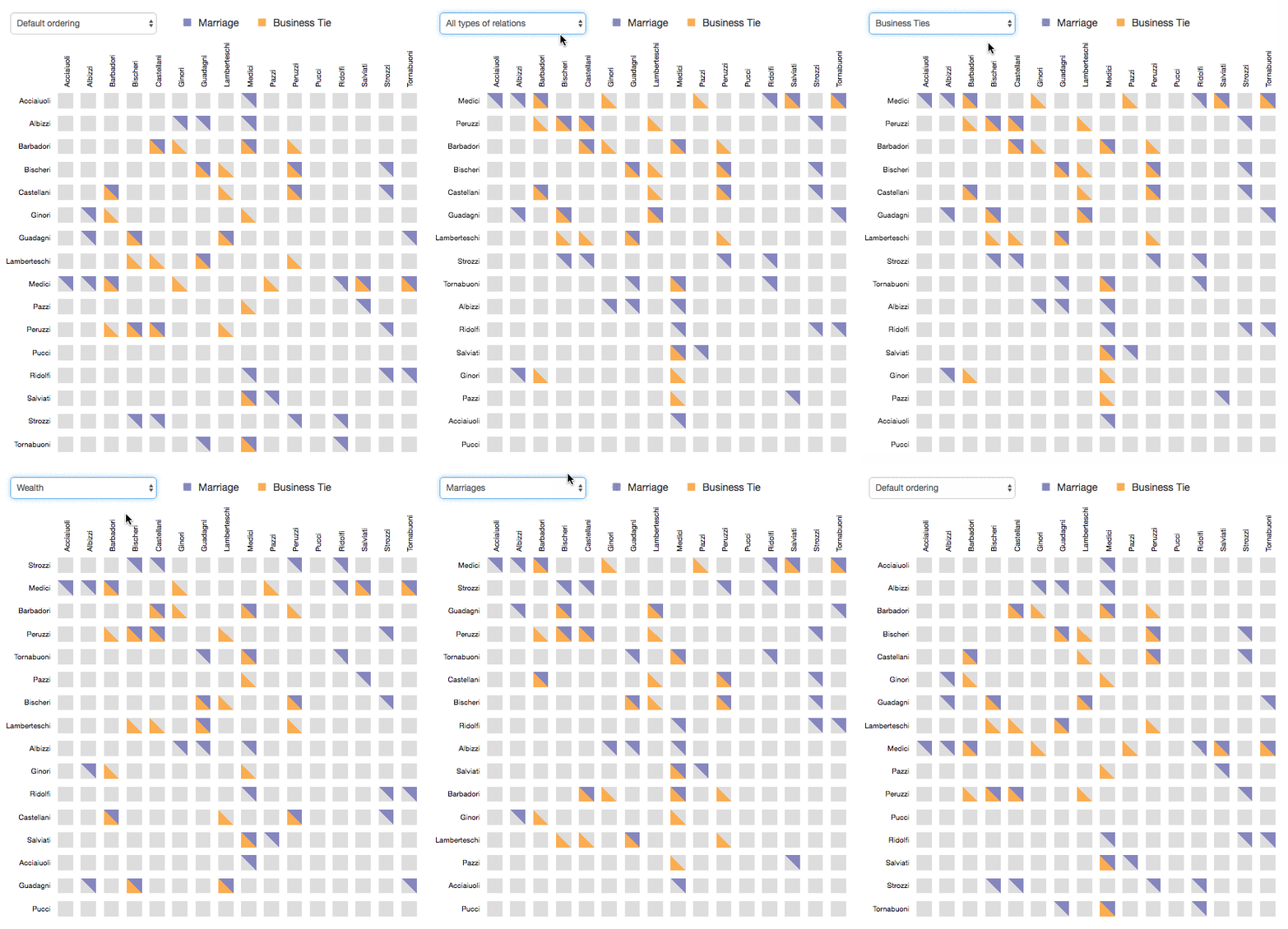
This sortable matrix visualization can encode two types of relationships simultaneously. Especially when displaying a network with many edges it is definitely worth to consider a matrix representation instead of a network graph.
Implementation checklist:
- Create a matrix visualization that visualizes the relations between these 16 families
- Merge the datasets and label the rows and columns with the corresponding family names
- Draw two triangles in each cell to encode both relationships (marriages and business ties)
- Make the matrix sortable (at least the rows but optionally also the columns)
- Include animated transitions to make it easier to follow changes
- Add a legend to explain the types of relationships
We give you some more pointers and hints below, however, we encourage you to try to work through this as independently as possible. Only use the extra hints (specially marked) if you do not know how to get started on a certain task!
We suggest that you go through the following four iterations:
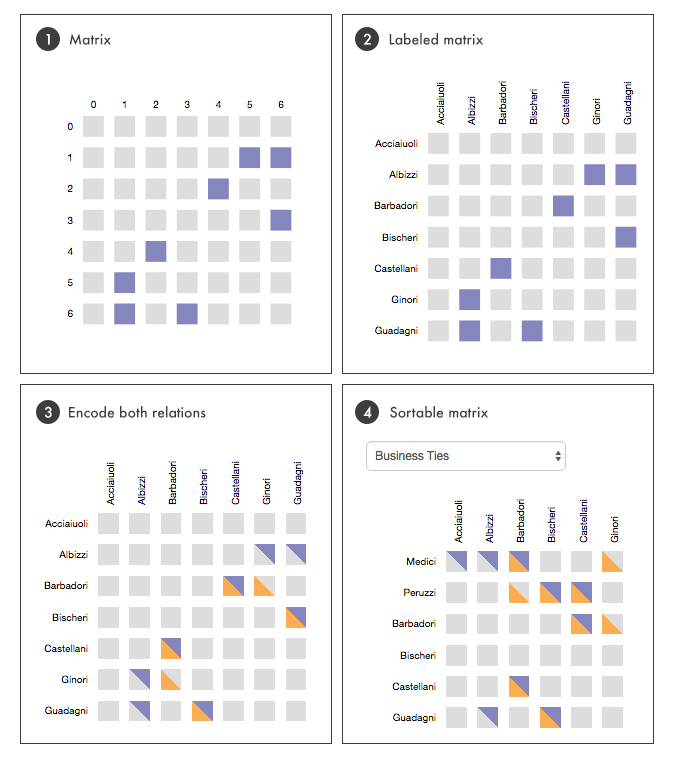
Get started
1) Set up a new D3 project (HTML, CSS, JS files). You should already have a template project that you can reuse for that.
2) Please download the CSV file: http://www.cs171.org/2018/assets/scripts/lab8/florentine-familiy-attributes.csv
3) The adjacency matrices are only available in the raw text format shown above. Copy the matrices and integrate them into your code so that you can easily access each element with matrix[i][j].
4) Sanity check: Print the data of all 3 files with console.log() to make sure that the data is correct. (You should always check for errors before you continue to the next step in a project.)
***Extra hint*** (click me only if you are stuck)
1. D3 project template: [http://www.cs171.org/2018/assets/scripts/d3_project_template.zip](http://www.cs171.org/2018/assets/scripts/d3_project_template.zip) 2. Adjacency matrices: There are two different strategies to handle this data: - a) Create one csv file per adjacency matrix, read in the files, and convert each matrix into a JS variable (a 2D array). This is the cleanest solution, and allows you to easily use different matrices. - b) This is the quick and dirty solution, which is sufficient if you are sure that the data will never really change. You can store the matrices directly as JS variables in your JS file. Just initialize a 2D array directly with the values listed above.
Create a matrix visualization with D3
D3 is an extremely flexible library, thus, there are multiple ways to draw matrix visualizations / heatmaps. One option is to store the data in a two-dimensional array (which we recommend for this lab). In the first step you can iterate through the first dimension (rows) and append for each array a new SVG group-element. Group-elements have no direct visual appearance but you can use, for example, the transform attribute to shift all the elements within the group to an appropriate position along the y-axis. Also add a text element that shows the label of that row.
In the second step you can iterate through the second dimension (columns). Each row contains an array with a sequence of 0s and 1s. Depending on the value you can draw a grey or colored rectangle. If you feel solid on this, you could also directly draw two triangles for each matrix element instead of a rectangle.
1) Pick one matrix for now, and draw its matrix visualization.
2) Draw the matrix rows.
3) Draw the individual matrix elements, and color them based on their value.
4) Add labels for rows as well as columns.
5) Check that your visualization roughly looks like the picture 1 shown above.
Free hint: Try to always split your approach into smaller tasks that you can tackle one after the other. For example, first make sure you can draw rows. You could start with just drawing a text label per row, just for debugging. Once that works, work on drawing something for each element (matrix[i][j]). Once that works, work on drawing the actual visual element (colored triangle) for that data.
***Extra hint*** (click me only if you are stuck)
1. Create a ```matrix.js``` file for your matrix visualization. Init it after you have finished loading in the data in ```main.js``` 2. In ```initVis()``` you should set your margins, SVG drawing area, and other init values you might need, and call ```wrangleData()```. 3. In ```updateVis()```: Draw the matrix rows: assign a class (e.g. ```.matrix-row```), append a svg group element per row, translate its height, and append a text field (basically the y-axis label of that row). You should now see a column of labels showing numbers from 0 - 15. 4. In ```updateVis()```: Draw all matrix elements: Assign classes (e.g., matrix-cell, matrix-cell-marriage), draw a small rectangle, and set its color depending on the data properties (matrix value 0 or 1) 5. Draw x-axis labels: Append text for each column. Remember that the numbers of columns and rows is equal! Translate the labels to their correct position.
Data wrangling
A good approach for wrangling the given datasets would be to process and merge all three datasets (in wrangleData()). You can create a new JS object for each family with the surname and sub-arrays for marriages and business ties. This structure will also help you later to efficiently sort the dataset, because you can add additional attributes, such as the number of business ties for each family.
Example structure:
var data = [
	{
		...
	},
	{
		"index": 8,
		"name": "Medici",
		"allRelations": 11,
		"businessTies": 5,
		"businessValues": [0,0,1,0,0,1,0,0,0,1,0,0,0,1,0,1],
		"marriages": 6,
		"marriageValues": [1,1,1,0,0,0,0,0,0,0,0,0,1,1,0,1],
		"numberPriorates": 53,
		"wealth": 103
	},
	{
		"index": 9,
		"name": "Pazzi",
		...
	}
];
1) Create a JS object for each family, containing all the attributes listed in the example code above
2) Add each family object to an array containing all families.
Free hint: In many projects you can make your life a lot easier by making sure that you have converted the data into a format that is ideal for your further processing/visualization tasks. Especially for smaller datasets it often pays of to create a different datastructure that allows you to easily access all of it.
***Extra hint*** (click me only if you are stuck)
1. Create an empty array ```displayData``` in ```initVis``` 1. In ```wrangleData``` you can use a ```forEach``` loop to go over e.g. the marriage dataset. The important thing is that you are looping over all families. 2. Inside the loop create a ```var family = {...``` and add all attributes you want to store to it. 3. Inside the loop, add that object to your ```displayData``` array.
Draw triangles in D3
In the preview and the problem description we have introduced the idea of encoding two relations in one single cell. Instead of drawing one rectangle we can stack two triangles on top of each other. As a result users can see at first glance which families have multiple relationships and other further details.
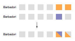
In SVG you can create lines, circles, rectangles etc, but not directly triangles. Therefore, you have to use the path element. You have used SVG’s path already, but most likely always in combination with the D3 path generator. Now, you have to specify the path manually.
The path information is specified within the d attribute:
<svg height="250" width="300">
    <path d="M150 5 L75 200 L225 200 Z" fill="blue" />
</svg>
M: translates to “move to” and specifies the starting point (x/y coordinate)L: translates to “line to” and draws a line from the current point to the following coordinatesZ: translates to “close path”. It closes the triangle path by connecting the last point with our initial point.
There are more commands but for our use case the above mentioned options are sufficient. Important: uppercase commands indicate absolute coordinates and their lowercase counterparts indicate a coordinate relative to the previous coordinate.
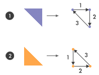
Example code snippet for the upper triangle (#1):
var cellHeight = 20, cellWidth = 20, cellPadding = 10;

// D3's enter, update, exit pattern
var trianglePath = row.selectAll(".triangle-path")
	.data(data);

trianglePath.enter().append("path")
	.attr("class", "triangle-path");

trianglePath.attr("d", function(d, index) {
	// Shift the triangles on the x-axis (columns)
	var x = (cellWidth + cellPadding) * index;

	// All triangles of the same row have the same y-coordinates
	// Vertical shifting is already done by transforming the group elements
	var y = 0;

	return 'M ' + x +' '+ y + ' l ' + cellWidth + ' 0 l 0 ' + cellHeight + ' z';
});
1) Change your code so that you draw two triangles instead of the previous rectangle. one triangle represents the marriage information, the other one the business information.
Sortable matrix and legend
By now you have implemented your custom matrix visualization, including triangles. Next, you will improve it with a basic sorting function.
The user should be able to sort the rows by
- Number of business ties
- Number of marriages
- Number of all relationships
- Wealth
- Number of seats hold in the civic council (priorates)
By default the families should be ordered by their surname.
As already mentioned above, it is very helpful if you merge the datasets and create a JS object for each family. That gives you the possibility to calculate the statistics (e.g. count all business ties for each family) in advance.
Integrate a select-box with the sorting options and react to change events. If you have implemented D3’s enter, update, exit pattern you can call the updateVis() function, sort the families and update the visual elements.
Include animated transitions that make it easier to follow when the sorting of the data is being updated. When the user sorts the data, a particular data point (family in our case) can be tracked visually through the transition. This concept is called object constancy and you can adopt it by specifying a key function. You have already learned how to implement it:
var row = svg.selectAll(".row")
	.data(data, function(d){ return d.name; });
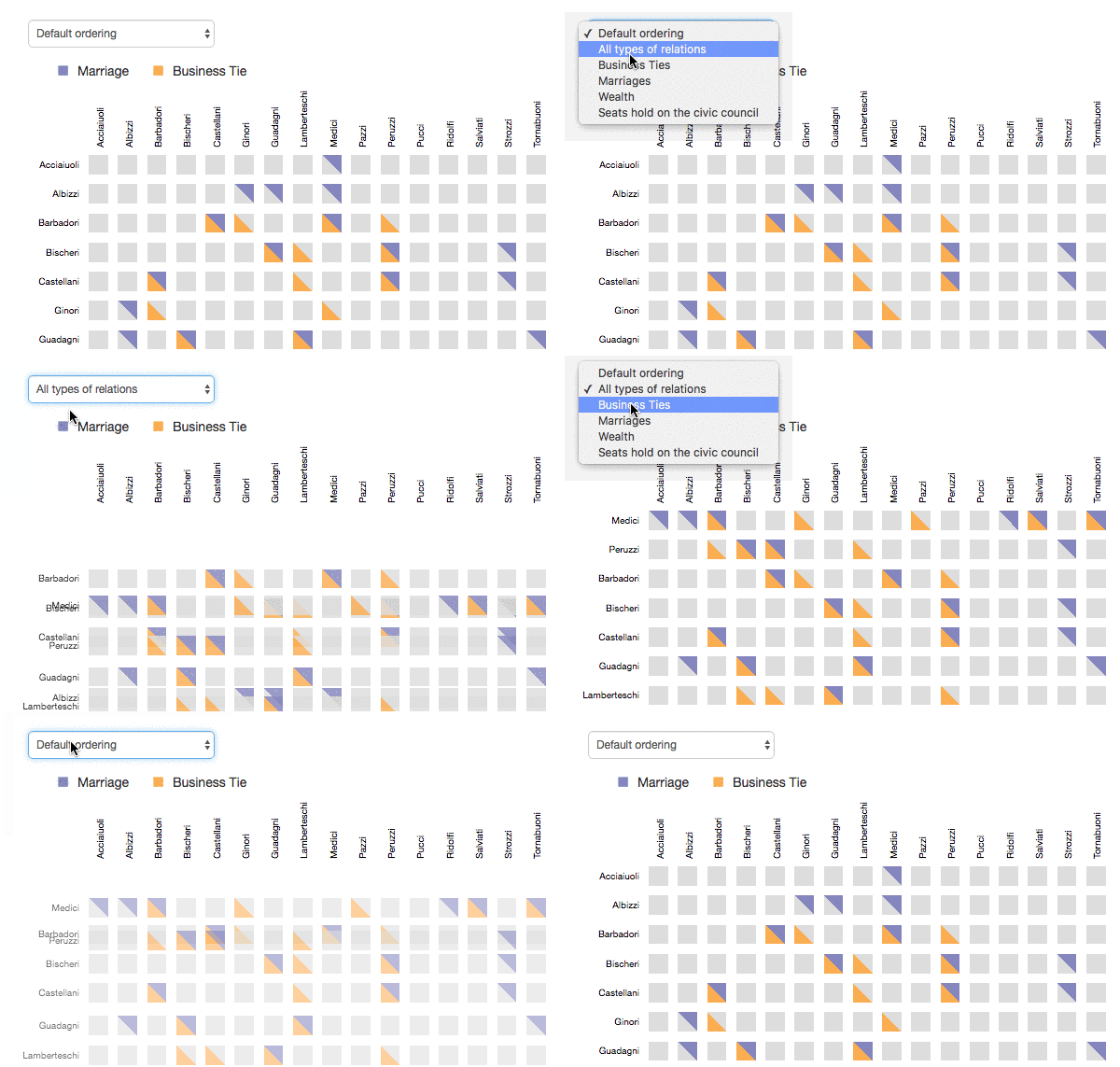
(Notice: we made the transition particularly slow for demonstration purposes)
You can also change the fill-opacity during the transition for a cleaner animation.
1) Add a select-box to your html file that allows users to select the sorting order. Add all the sorting options listed above.
2) Implement a call-back for the select-box to update the visualization.
3) Extend updateVis to support for sorting. Remember, you only want to sort the rows in your matrix view!
4) Add animated transitions.
5) Add a legend to explain the two different types of family ties being shown.
***Extra hint*** (click me only if you are stuck)
1. In your select-box call back, make sure to execute ```updateVis()``` and also transmits the value of the selected sorting order as a function parameter. 2. In ```updateVis()``` first sort your ```displayData``` array based on the selected sorting order. Print the result to the console to verify the sorting! 3. Specify a key function, based on the familiy's name, to support animated transitions. 4. Make sure you follow the enter, update, exit pattern.
Bonus Activity 1 - Flexible layout
You have probably used hard-coded values for all size specifications in your view. Adapt your matrix implementation so that it is possible to define an SVG area (width and height) and the sizes of all other elements and the spacing between them will be calculated automatically.
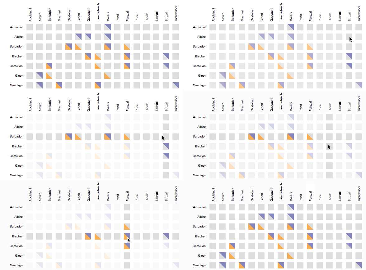
Bonus Activity 2 - Highlight cells on mouseover
Listen to mouse events: If the user hovers over a cell highlight all elements that are in the same row or in the same column of the matrix.
Preview:
Submission of lab
Congratulations, you have now completed Lab 8!
Please submit the code of your completed lab (the sortable matrix visualization and optionally the bonus activities) on Canvas.
Resources
- Custom visualizations with D3: http://jsdatav.is/chap07.html#creating-a-unique-visualization
- SVG for beginners: http://unicorn-ui.com/blog/svg-for-beginners.html
- D3 object constancy: https://bost.ocks.org/mike/constancy/
- Padgett Florentines Families: http://home.uchicago.edu/~jpadgett/papers/unpublished/maelite.pdf