

Lab 7
Pre-Reading Quiz
Please fill out the pre-reading quiz on Canvas at the beginning of class!
Learning Objectives
- Understand the concept of D3 layouts and be able to use D3 layouts for advanced visualizations (e.g., graphs, trees or stacked area charts)
- Know how to work with the GeoJSON and TopoJSON file format
- Have a basic understanding of geographical projections
- Know how to load multiple files sequential and parallel
- Know how to convert geodata to screen coordinates with D3 in order to create interactive maps
Prerequisites
- You have read and programmed along with chapter 13, and 14 (p. 281-295) in D3 - Interactive Data Visualization for the Web.
- Optional reading: p. 295-322 in D3 - Interactive Data Visualization for the Web.
In this lab you will learn how to use D3 layout methods to implement more complex visualizations (as compared to scatterplots and simple bar charts). In the second part of the lab you will learn how to map and display geographical data.
This lab covers two different concepts (layouts and maps) that are vital for your final projects. The lab is longer than usual, but you do not have to complete a separate homework this week. The homework consists of just submitting your completed lab!
D3 Shapes
The D3 shape methods have no direct visual output. Rather, D3 shapes take data that you provide and re-map or otherwise transform it, thereby generating new data that is more convenient for a specific task. (Scott Murray)
D3 offers a number of different shapes, each with distinct characteristics:
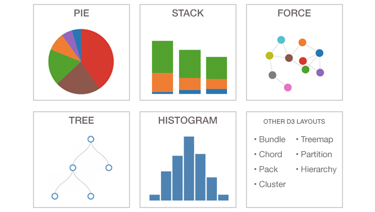
Each shape may have distinct features not shared by others, so make sure to consult the D3 documentation(https://github.com/d3/d3-shape/blob/master/README.md) for implementation details. You will learn more about a few selected shapes in this lab.
Pie Shape
The d3.pie() methods can be used to compute the start and end angles of arcs that comprise a pie or donut chart.
Example:
// Initialize data
var data = [45,30,10];

// Define a default pie layout
var pie = d3.pie();

// Call the pie function
pie(data);
Console Output:
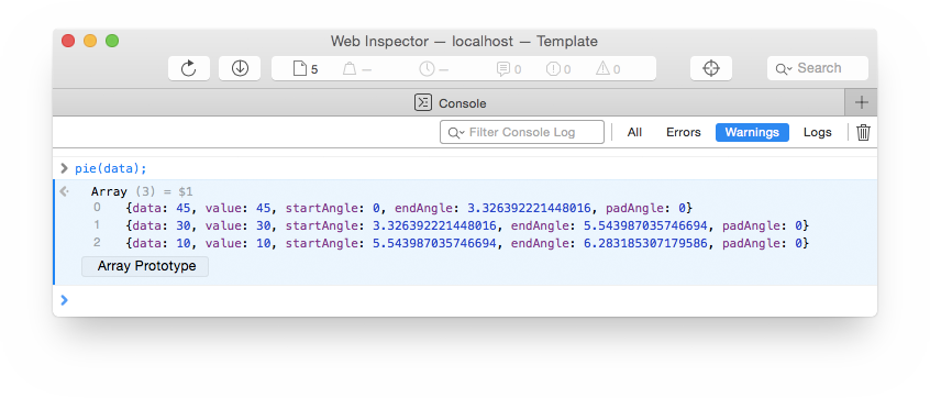
The D3 pie shape takes a dataset and creates an array of objects. Each of those objects contains a value from the original dataset, along with additional data, like startAngle and endAngle.
That’s all there is to the D3 pie shape. It has no visual output, but transforms the input data in a way that it is much more convenient for drawing a pie chart.
Now, we’ll draw a pie chart. We use the function d3.arc() to generate the paths for the pie segments. Take a few minutes to look through the following code example:
// SVG drawing area
var width = 300,
    height = 300;

// Position the pie chart (currently only a placeholder) in the middle of the SVG area
var svg = d3.select("body").append("svg")
    .attr("width", width)
    .attr("height", height)
    .append("g")
    .attr("transform", "translate(" + width / 2 + "," + height / 2 + ")");

// Initialize the data
var data = [45,30,10];

// Define a default pie layout
var pie = d3.pie();

// Ordinal color scale (10 default colors)
var color = d3.scaleOrdinal(d3.schemeCategory10);

// Pie chart settings
var outerRadius = width / 2;
var innerRadius = 0;      // Relevant for donut charts

// Path generator for the pie segments
var arc = d3.arc()
    .innerRadius(innerRadius)
    .outerRadius(outerRadius);

// Append a group for each pie segment
var g = svg.selectAll(".arc")
    .data(pie(data))
    .enter()
    .append("g")
    .attr("class", "arc");

// Use the path generator to draw the arcs
g.append("path")
    .attr("d", arc)
    .style("fill", function(d, index) { return color(index); });
Result:
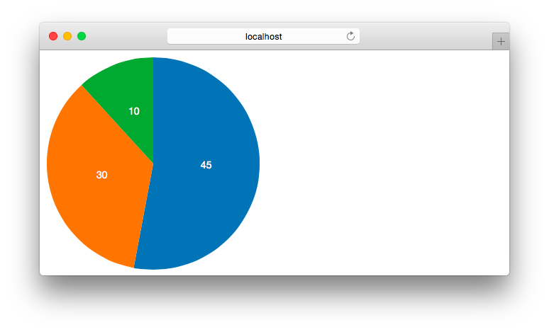
The screenshot shows text labels for each pie segment that highlight the data values. These labels are not generated automatically, but are easy to add:
// Position the labels by using arc.centroid(), which calculates the center for each pie chart segment
g.append("text")
    .attr("transform", function(d) { return "translate(" + arc.centroid(d) + ")"; })
    .attr("text-anchor", "middle")
    .attr("fill", "#fff")
    .text(function(d) { return d.value; });
Important Notice
We have used a pie chart as an example because it is one of the most popular chart types and it demonstrates the concept of D3 shapes very well. However, it is also very important to mention that pie charts are often not the best way to represent data! Humans are not very good at comparing slices of a circle, and pie charts easily lead to misunderstandings or give false impressions of the data. Usually, other visualization methods are more effective, so most of the time you shouldn’t use pie charts. If you do, make sure to compare only a very low number of elements within these charts.
Force Layouts
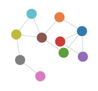
The force layout or force-directed layout is typically used to create network graphs, or also called node-link-diagrams. It consists of nodes and edges (links connecting the nodes) and helps us to visualize networks and the relationships between objects (e.g., social networks, relationships between politicians, protein–protein interaction networks, business relations, …).
The name force-directed layout comes from the fact that these layouts use simulations of physical forces to arrange elements on the screen. The goal is to reduce the number of crossing edges, so that is easy for the user to analyze the whole network.
https://github.com/d3/d3-force/blob/master/README.md
Activity I
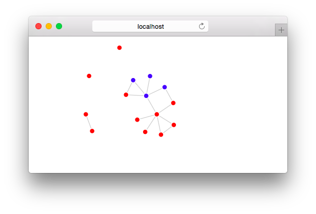
In this activity you will use a force layout to create connections between the world’s busiest airports. The connections are randomly generated and give an example of a simple network structure.
Preview:
-
Download the template
http://www.cs171.org/2018/assets/scripts/lab7/template.zip
The provided template includes
- the data, which is already conveniently stored in JSON format (
data/airports.json) - the HTML file
index.htmlwith a basic document structure - and the JS file
js/activity1.js
- the data, which is already conveniently stored in JSON format (
-
Analyze the dataset
The file
activity1.jsalready creates an SVG area and loads the dataset.Create a debug message and analyze the airport data in the web console.
-
Implement the force-directed graph
We have included a few comments in the JS file to show you the basic structure.
-
Initialize the d3.forceSimulation()
var force = d3.forceSimulation(data.nodes) .force("charge", d3.forceManyBody().strength(-10)) .force("link", d3.forceLink(data.links).distance(30)) .force("center", d3.forceCenter().x(width/2).y(height/2)); -
The parameters of the force simulation can be tweaked as shown above where the charge strength is set to -10, and link distance set to 30. You can learn about these parameters in the next sections, and in the documentation. Another important feature of force layouts is the positioning of elements. While the pie layout returns the angles of the segments that we can map to the screen by using the d3.arc() function, the force layout automatically starts running the simulations of the physical forces that hold the graph together. Each iteration of the force-layout is called a “tick”, similar to iterations in other physics simulations. With each tick, the force layout adjusts the x/y coordinates for each node and edge.
-
Map the data (nodes and edges) to visual elements.
Create an SVG circle for each node and an SVG line for each edge of the network. You should define the properties (class, radius, stroke, fill color etc.) as usual but without setting the x/y coordinates, since they are not calculated until the simulation has started.
// Draw nodes var node = svg.selectAll(".node") .data(data.nodes) .enter().append("circle") .attr("class", "node") .attr("r", 5) .attr("fill", "green"); // Draw edges ... -
D3 triggers a “tick” event at each iteration. You should take these x/y values and update the SVG elements in your DOM tree:
  force.on("tick", function() {

      // Update node coordinates
      node
          .attr("cx", function(d) { return d.x; })
          .attr("cy", function(d) { return d.y; });

      // Update edge coordinates
      ...
  });
Run your code and check if you have successfully implemented the force layout!
-
-
Implement draggable nodes
The d3.drag() method allows interactive dragging of nodes. Use this method in conjunction with the call operator on the nodes:
 node.call(d3.drag()
     .on("start", dragStarted)
         .on("drag", dragging)
         .on("end", dragEnded));
In the above example, the functions dragStarted, dragging, and dragEnd are called during different stages of dragging.
-
Change the fill color of the nodes
Draw airports in the Unites States blue and all other airports red
-
Show airport names
After drawing the graph and setting different colors we can already recognize different aspects, but it would be helpful to identify the individual airports. You can either implement a click listener or show tooltips on mouseover.
Instead of creating your own tooltips (as in previous labs/homeworks), you can use the browser’s default tooltips by appending a title element.
 node.append("title")
   .text(function(d) { return d.name; });
After including this code snippet, you can hover over a node to see the airport name. Note: This is the browser’s integrated tool tip feature, so please be patient. You will have to hover over a node for several seconds before the tool tip appears!
-
Customize the D3 force layout
Until now we used the default parameters for the force layout. But D3 offers plenty of methods to customize the simulation. This becomes very important when you have to deal with larger networks.
Define custom settings using chain syntax and observe the differences in the rendered graphs.
// Example with custom link distance var force = d3.forceSimulation(data.nodes) .force("charge", d3.forceManyBody().strength(-10)) .force("link", d3.forceLink(data.links).distance(30)) .force("center", d3.forceCenter().x(width/2).y(height/2));- linkDistance
- charge
- centering
- …
The different settings are explained in the D3 wiki: https://github.com/d3/d3-force/blob/master/README.md
Congratulations, you have finished your first network visualization! Of course there are many ways to improve this initial visualization, but this should have given you an idea on how to use D3 layouts.
Now that you have been introduced to D3 shapes and force layouts feel free to explore the different layouts, their features, and their differences to each other! Pie charts and network diagrams are just the beginning!
Geomapping
In the second part of this lab we will focus on a different topic: We want to show you how to convert geographical data to screen coordinates, in order to create interactive maps. These maps can show specific regions, countries or whole continents. You will learn how to render geographic data as paths, how to assign colors and how to draw data points on top of the map.
GeoJSON
GeoJSON is a JSON-based standard for encoding a variety of geographic data structures. We need the data (e.g., country boundaries, points of interests) in a proper format to generate visualizations of geographic data. Web browsers and especially D3 are not able to render traditional shapefiles, which are used by experts in geographic information systems (GIS). Therefore, GeoJSON has been established as a common way to store this information for use in web browsers.
The sub-units in GeoJSON files are called Features. They contain the geodata (points, polygons, lines, …) and very often additional information about the objects, for example, the names and the ISO codes of countries. All the features are part of the main object, the FeatureCollection.
Example:
{
	"type" : "FeatureCollection",
	"features" : [
		{
		  "type": "Feature",
		  "geometry": {
		    "type": "Point",
		    "coordinates": [51.507351, -0.127758]
		  },
		  "properties": {
		    "name": "London"
		  }
		},
		{
			...
		}
	]
}
In this example we have a feature which represents a single geographical point. The coordinates of the point are specified as an array with longitude and latitude values ([-0.127758, 51.507351]). In GeoJSON the first element indicates the longitude, the second element the latitude value.
In many more cases, GeoJSON files contain complex polygon data that represent the boundaries of multiple regions or countries instead of a plain list of points:
"geometry": {
	"type": "MultiPolygon",
	"coordinates": [[[[-131.602021,55.117982],
		[-131.569159,55.28229],[-131.355558,55.183705],
		[-131.38842,55.01392],[-131.645836,55.035827], ...
    ]]]
}
Depending on the resolution of the dataset, each feature will include more or less longitude/latitude pairs. As you can imagine, the size of a GeoJSON file becomes tremendously high if you store the boundaries of a whole continent in high resolution.
TopoJSON
TopoJSON is an extension of GeoJSON that encodes topology. The generated geographical data is substantially more compact than GeoJSON and results in a file size reduction of roughly 80%.
Depending on your needs, you will probably find appropriate TopoJSON files online. You can also generate custom TopoJSON files from various formats with the TopoJSON command-line tool.
→ Whenever you want to use a TopoJSON file in D3, you will need the TopoJSON JavaScript library to convert the data to GeoJSON for display in a web browser: http://d3js.org/topojson.v1.min.js
In addition to the GeoJSON conversion, the JS library provides further methods, for example, to get the neighbors of objects or to combine multiple regions (topojson.mesh()).
Workflow to implement a map with D3
Create projection ⇒ Create D3 geo path ⇒ Map TopoJSON data to the screen
D3 projections
Drawing a geographical map in D3 requires the mapping of geographical coordinates (longitude, latitude) to screen coordinates (x, y). The functions to process the mapping are called projection methods. D3 already includes a set of the most common geo projections.
This image shows four different projections in D3:
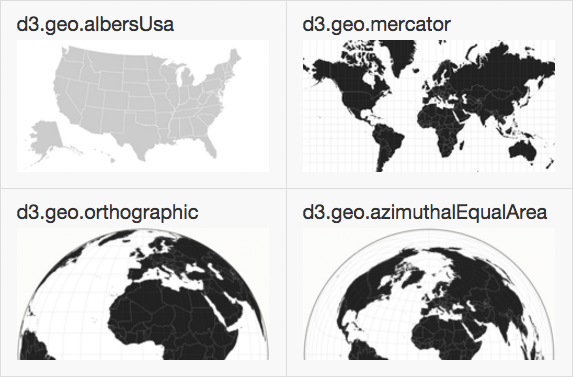
(You can take a look at the documentation to see more examples of geo projections.)
When projecting positions from a sphere (i.e., the world) to a 2D plane, these different projection methods can have very different results. Different projection methods have different characteristics (e.g., distance, direction, shape, area) and show different levels of distortion.
The following code defines a projection function (“albersUsa”), which is designed specifically for displaying North America, and sets the center to the middle of the visualization (SVG area):
var projection = d3.geoAlbersUsa()
		.translate([width / 2, height / 2]);
The projection can be further customized by using parameters like .scale(), .rotate(), .clipAngle(), …
D3 geo path
The path generator takes the projected 2D geometry from the last step and formats it appropriately for SVG. Or in other words, the generator maps the GeoJSON coordinates to SVG paths by using the projection function.
var path = d3.geoPath()
    .projection(projection);
Load TopoJSON data and map it to geo path elements
After defining the SVG area, the projection and the path generator, we can load the TopoJSON data, convert it to GeoJSON and finally map it to SVG paths.
// Load shapes of U.S. counties (TopoJSON)
d3.json("data/us-10m.json", function(error, data) {

	// Convert TopoJSON to GeoJSON (target object = 'states')
	var usa = topojson.feature(data, data.objects.states).features

	// Render the U.S. by using the path generator
	svg.selectAll("path")
			.data(usa)
		.enter().append("path")
			.attr("d", path);
});
After setting the fill color with CSS the result looks like this:
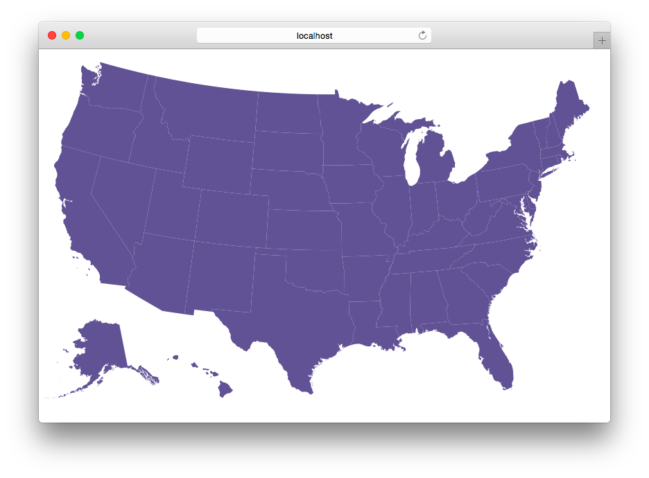
For some maps, the boundaries between the states might not be very accurate. An alternative solution is to explicitly draw the borders (e.g. of US states). For that we can use topojson.mesh to extract separating lines between states from the TopoJSON data.
svg.append("path")
	.datum(topojson.mesh(data, data.objects.states))
	.attr("d", path)
	.attr("class", "subunit-boundary");
The accessor for the specific object you want to extract (e.g. data.object.states) is always dependent on your TopoJSON data. In this example we have used the file us-10m.json from Mike Bostock, which contains geographical data for counties and states of the USA. That means we could change data.objects.states to data.objects.counties to go one level deeper and map U.S. counties.
Before you start with the next activity we will briefly explain how to load multiple files with D3.
Loading multiple files with D3
Until now you have worked only with single external files - one CSV file, one JSON file, etc. - but in the future you will probably have to deal with multiple files. You could merge the files manually and then load it with D3 as a whole bunch of data, but very often you cannot or don’t want to mix everything together in a single file.
You can load files separately:
d3.json("data1.json", function(data1) {
	// Visualize data1
});

d3.json("data2.json", function(data2) {
	// Visualize data2
});
The files are loaded asynchronously so you can’t predict which one is loaded first. This will affect the rendering order and may cause unwanted side effects.
For example, if you want to render a map with multiple markers and you are using this approach, the script might draw the markers first and then cover them when the map paths are drawn (see Figure).
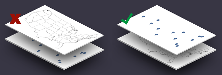
To solve this problem, you can load the files in series:
d3.json("data1.json", function(data1) {
    d3.json("data2.json", function(data2) {
		// Visualize data1
		// Visualize data2
	});
});
The disadvantage with the sequential method is, that the loading of data2.json will only start once the first dataset is loaded completely and this will delay the visualization unnecessary.
You can also load the files in parallel by separating the loading (like in the first example) and then implementing an separate function for the visualization. You will need an extra variable that contains the current state of the loading process for this approach. Every time a file is loaded completely it will check if it was the last file to complete loading, and if so, it will call the function to draw the visualization.
You can implement this on your own or you can use, for example, queue.js, which is another very helpful library from Mike Bostock: http://d3js.org/queue.v1.min.js
Queue.js - asynchronous helper library for JavaScript:
// Load data parallel
queue()
    .defer(d3.json, "data1.json")
    .defer(d3.json, "data2.json")
    .await(createVisualization);

function createVisualization(error, data1, data2) {
	// Visualize data1 and data2
}
In the next activity you will create a geographic map (world atlas) that displays the aiports from Activity I. You will have to load the map data and the airport coordinates, therefore, it is a good opportunity to try queue.js straight away.
Activity II
-
Extend your project from Activity I
- Create an HTML file (
map.html) and include a headline, an empty container for the visualization and a reference to the D3 library. - Create an empty JS file.
- Create an HTML file (
-
Download the geographic data (world atlas)
http://www.cs171.org/2018/assets/scripts/lab7/world-110m.json
Format: TopoJSON
The file contains the shapes of all countries in relatively low resolution: “country boundaries at 1:110,000,000 scale (1:110m)”.
This means that one unit of measurement in the file corresponds to 110 million units in the actual, physical world. This scale works fine for a low-detail map of the world. But in the previous map, for example, we wanted to show detailed contours of a specific country, so we have used a very high resolution (1:10m scale).
-
Include the TopoJSON JavaScript library in
map.htmlhttp://d3js.org/topojson.v1.min.js
As mentioned previously, don’t reference directly to external resources. Otherwise, you cannot be sure that the library is always available in its current state.
<!-- BAD --> <script src="http://d3js.org/topojson.min.js"></script> <!-- GOOD --> <script src="js/topojson.min.js"></script> -
Render the map with D3
In your new JS file:
- Create an SVG area (width: 1000px, height: 600px)
- Create a mercator projection and specify it in a new geo path generator
- Load the TopoJSON file with D3
- Convert the TopoJSON to GeoJSON
- Render the world atlas by using the path generator
-
Refine the projection
If you have used the default projection settings it is likely that the map is getting clipped off. Play around with parameters like
.center()and.scale()to modify the projection. If you have trouble, consult the D3 wiki for further explanations and other parameters: https://github.com/d3/d3-geo/blob/master/README.md. -
Change the styles with CSS (optional)
-
Include the JavaScript library queue.js and load two datasets in parallel
In the next step you should mark the airports on the map, that means you have to load an additional JSON file with the aiport data and restructure your JS file.
Download the library queue.js (http://d3js.org/queue.v1.min.js) and reference it in map.html
Replace
d3.json("...", function(data) { ... });with the loading sequence from queue.js and create a separate function for the actual rendering of the map (see example above).→ Load both datasets and try to render the world atlas like before, without the airports.
-
Create a point on the map for each airport
If you have successfully integrated queue.js and loaded the two external JSON files - and the “mercator” projection of the world is still visible in the browser - you are ready to map the airports.
Draw an SVG circle for each airport.
You can specifiy the positions, by using your projection, in the following way:
.attr("transform", function(d) { return "translate(" + projection([d.longitude, d.latitude]) + ")"; }) -
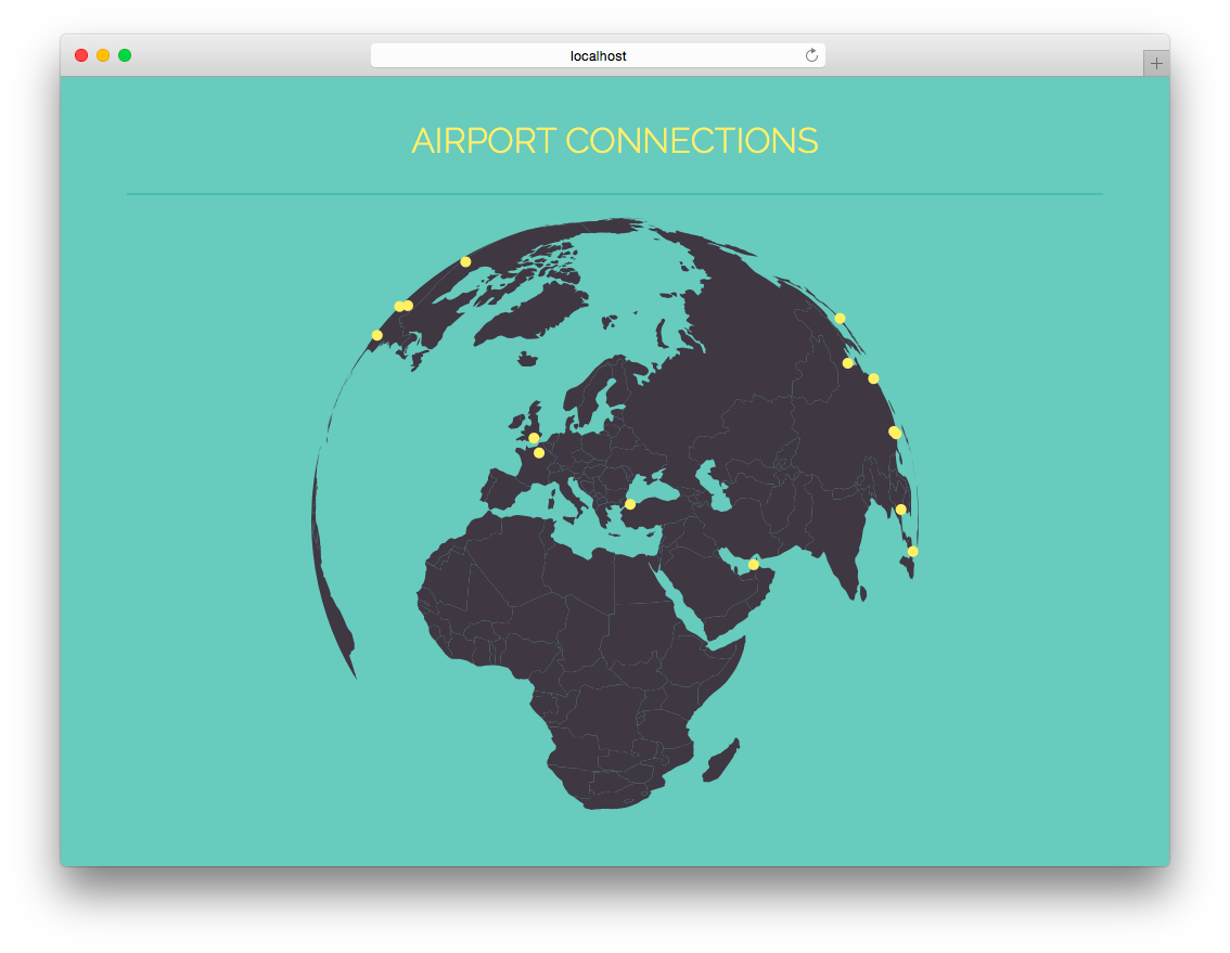
Change the geo projection
Create a comment around your current mercator projection and try other D3 geo projections, e.g. d3.geoOrthographic().
D3 geo projections: https://github.com/d3/d3-geo/blob/master/README.md
Note that you can update the projection easily without changing other pieces of code.
Example with an orthographic projection:
Choropleth Maps
In a few weeks you will learn more about interactive maps and how to use map imagery (tiles) instead of vector data (GeoJSON/TopoJSON) to create visualizations.
But there is one type of vector map we would also like to mention in this lab - the choropleth map.
A Choropleth maps shows areas filled with different colors or patterns to reflect associated data values.
In the United States, so-called “red state, blue state” choropleth maps show the Republican and Democratic leanings of each state:
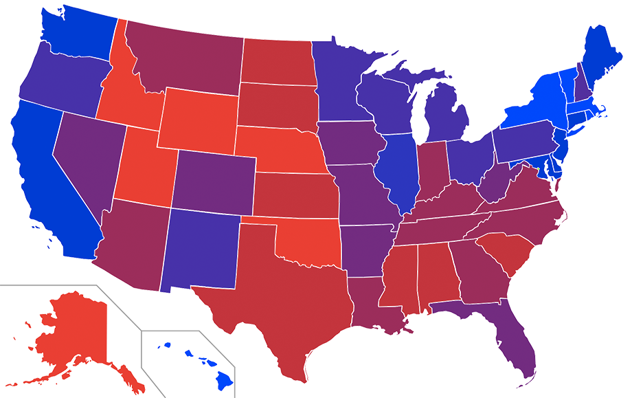
Choropleths can be generated from any values, not just political ones, and they become much more powerful if they are interactive and encourage the user to discover the data.
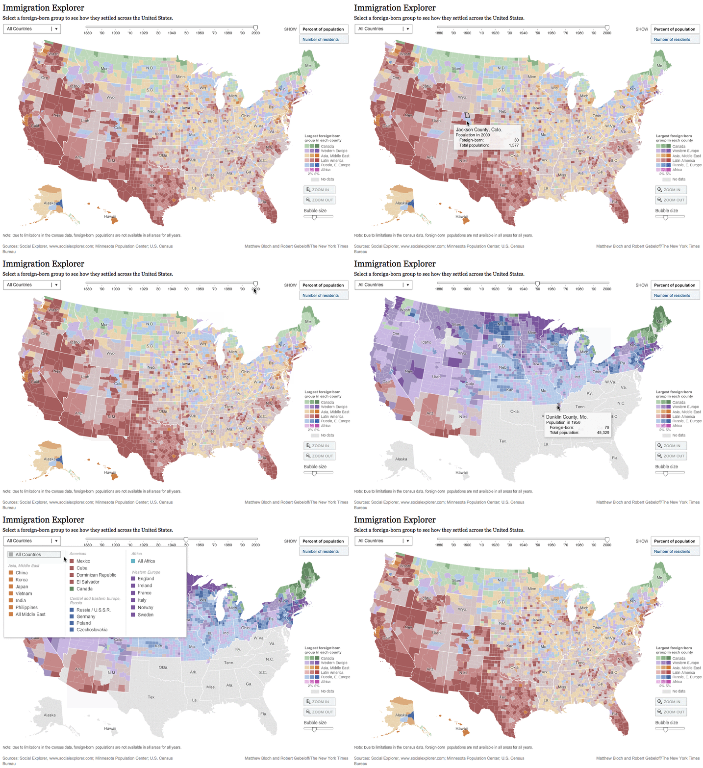
“Altough choropleths can be fantastically useful, keep in mind that they have some inherent perceptual limitations. Because they use area to encode values, large areas with low density (such as the state of Nevada) might by overrepresented visually.” - Scott Murray
Bonus Activity (optional)
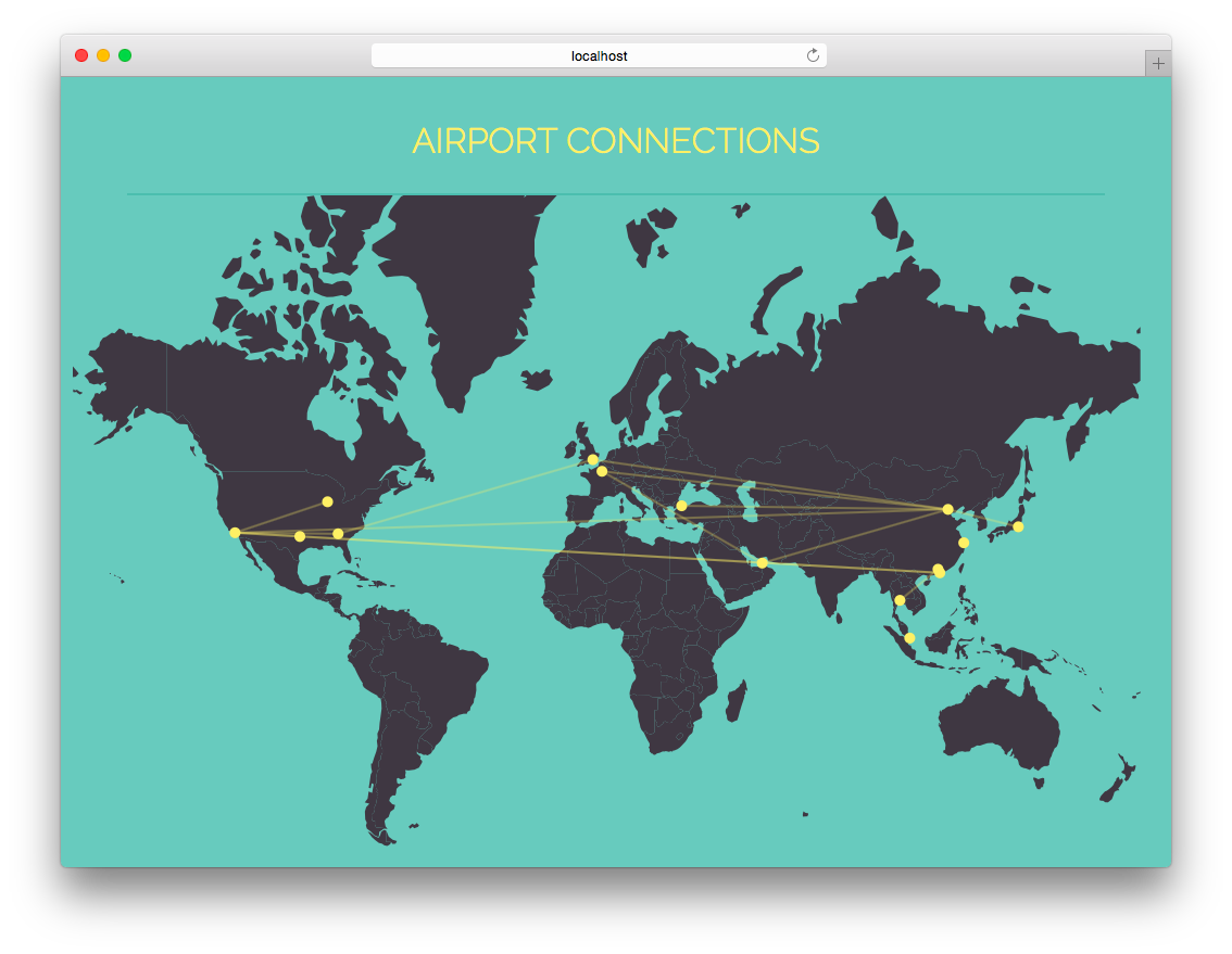
Similar to the first activity, now connect the airports with each other. The network data is stored in the file airports.json in the object links. The attributes source and target in each link element specify the index of the corresponding node in the nodes array.
→ Create SVG lines between the airports
Example with a mercator projection:
Submission of lab (activity I, and II)
Congratulations, you have now completed the activities of Lab 7!
Please submit the code of your completed lab (the final force layout and the map visualization of activities I and II).
Resources
- Chapters 13 (p. 267-289) and 14 (p. 291-325) in D3 - Interactive Data Visualization for the Web by Scott Murray
- http://bost.ocks.org/mike/map/
- https://github.com/d3/d3-geo/blob/master/README.mdd
- https://github.com/mbostock/topojson
- http://bl.ocks.org/mapsam/6090056
- https://www.jasondavies.com/maps/rotate/
- http://axismaps.github.io/thematic-cartography/articles/choropleth.htmlCS171-Lab6-Instructions