

Lab 5
Pre-Reading Quiz
Please fill out the pre-reading quiz on Canvas at the beginning of class!
Learning Objectives
- Learn the D3 update pattern (enter, update, exit)
- Load dynamic datasets and implement flexible scales and axes
- Handle mouse click events and changes of UI components
- Add D3 transitions
Prerequisites
- Chapter 9 in D3 - Interactive Data Visualization for the Web.
- Optional reading: Chapter 10 in D3 - Interactive Data Visualization for the Web.
- Optional reading: Mike Bostock’s ‘Thinking with Joins’ and Case 1 of https://medium.com/@mbostock/what-makes-software-good-943557f8a488).
Dynamic updates with D3
By now you have learned how to load external data and how to map it to visual elements like e.g., a bar chart. But very often you have to deal with a continuous data stream rather than a static CSV file. Dynamic data often requires more sophisticated user interfaces that allow users to interact with the data (e.g. filter, sort).
→ Instead of removing and redrawing visualizations each time new data arrives, update only affected components and focus on loading times and smooth transitions.
→ We will accomplish this by using the D3 update pattern (enter → update → exit).
“Updating data” means “joining data”
A data-join is followed by operations on the three virtual selections: enter, update and exit.
This means that we are merging new data with existing elements. In the merging process we have to consider:
- What happens to new data values without existing, associated DOM elements (enter)
- What happens to existing elements which have changed (update)
- What happens to existing DOM elements which are not associated with data anymore (exit)
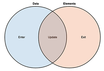
To take care of the update pattern you have to change the sequence of your D3 code a little bit. Instead of chaining everything together, some code snippets must be separated.
We create an SVG drawing space as usual:
var svg = d3.select("body").append("svg")
	.attr("width", 600)
	.attr("height", 200);
And bind the data to SVG circles:
var circle = svg.selectAll("circle")
    .data([5, 10, 15]);
The length of the dataset is 3 and we select all SVG circles in the document. That means, if there are 3 or more existing circles, the enter selection is empty, otherwise it contains placeholders for the missing elements.
The page is empty because we have not appended any circles yet. We can access the enter selection and append a new circle for each placeholder with the following statement:
circle = circle.enter().append("circle")
	.attr("r", function(d) { return d; })
	.attr("cx", function(d, index) { return (index * 80) + 50 })
	.attr("cy", 80);
(You might have noticed that we’ve actually already used this pattern multiple times in previous labs.)
But often you want to do the exact opposite operation. If someone filters the dataset you may want to remove existing elements. In this case, you have to use the exit selection. exit contains the leftover elements for which there is no corresponding data anymore.
We call the drawing function again with new data:
var circle = svg.selectAll("circle")
    .data([20, 30]);
The new dataset contains 2 elements but on the website there are currently 3 circles. We can access the exit selection and remove the element that has no data-binding anymore:
circle.exit().remove();
There is still one problem left: dynamic properties. We are using a data-dependent radius and the values in the new dataset have been changed. For this reason, we have to update the dynamic properties (that we previously set in the enter selection) every time we update the data. To do this we use the merge function to apply changes to the enter and update selection:
var circle = svg.selectAll("circle")
	.data(data);
The result of the data() method returns the updated selection.
Putting everything together:
var svg = d3.select("body").append("svg")
	.attr("width", 600)
	.attr("height", 200);

// Call visualization with 2 datasets sequentially
updateChart([5, 10, 15]);
updateChart([20, 30]);

function updateChart(data) {
	// Data-join (circle now contains the update selection)
	var circle = svg.selectAll("circle")
		.data(data);

	// Enter (initialize the newly added elements)
	circle.enter().append("circle")
		.attr("class", "dot")
		.attr("fill", "#707086")

	// Enter and Update (set the dynamic properties of the elements)
		.merge(circle)
		.attr("r", function(d) { return d; })
		.attr("cx", function(d, index) { return (index * 80) + 50 })
		.attr("cy", 80);

	// Exit
	circle.exit().remove();
}
Result:
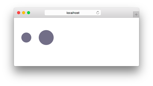
Key function
Before continuing with Activity 1 we will go one step back and look again at the data join. For the sake of clarity and simplicity, we have not mentioned an important detail - the key function - in the last example.
The key function defines which datum should be assigned to which element.
var circle = svg.selectAll("circle")
	.data([5, 10, 15]);
The code .selectAll("circle") selects all circle-elements and if we chain it with .data([5, 10, 15]) we are joining the given data with the selected circles. The default key function applies and the keys are assigned by index. In our example it will use the first three circles that it finds. The first datum (first item in our array) and the first circle have the key “0”, the second datum and circle have the key “1”, and so on.
Assume, that we have implemeted the “enter, update, exit”-pattern and appended the three circles to the webpage.
We can now start the pipeline again, with a slightly different array:
var circle = svg.selectAll("circle")
	.data([10, 15]);

The index will be used again as the default key to match the new data to the actual circles. There are three circles on the webpage and two items in the new dataset. Therefore, the last circle will be removed and the other two circles will be bound to the new data.
This is the simplest method of joining data and often sufficient. However, when the data and the elements are not in the same order, joining by index is insufficient. In this case, you can specify a key function as the second argument (callback function). The key function returns the key for a given datum or element:
// use the actual data value as key function
var circle = svg.selectAll("circle")
	.data([5, 10, 15], function(d) { return d; })

// enter, update, exit

circle = svg.selectAll("circle")
	.data([10, 15], function(d) { return d; })

// enter, update, exit
In the above example, the key function allows us to map the data value directly instead of the default by-index behavior:

This means, we can update the appropriate elements without having to delete and re-add elements. We can update them in place!
Additionally, a comment from Mike Bostock regarding key functions:
“The key function also determines the enter and exit selections: the new data for which there is no corresponding key in the old data become the enter selection, and the old data for which there is no corresponding key in the new data become the exit selection. The remaining data become the default update selection.”
If you are still unclear about the concept of key functions, we encourage you to look at Carlos Scheidegger’s explanation at home.
Activity I
In this activity you will visualize how customer orders are processed at a coffee shop.
-
Download the framework
http://cs171.org/2018/assets/scripts/lab5/template1.zip
The framework includes:
- A basic D3 project with a script that simulates the order queue
- an index.html file with a headline and an empty container for the visualization
You should implement the following steps in the file:
main.js -
Analyze the data stream
The function
updateVisualization()is called every time an order comes in or an order was processed.The script includes a debugging message function - open the webpage in a browser and check the web console to see information on unprocessed orders.
-
Append an SVG drawing area for the visualization (with at least 600 x 200px)
Keep in mind that
updateVisualization()is called every couple of seconds, so be careful that you create the SVG area only once (otherwise this becomes a very expensive process). -
Create the dynamic visualization
The visualization should consist of a label that indicates the current number of orders and x SVG circles that show the order queue.
You can use the following animation as a guide:
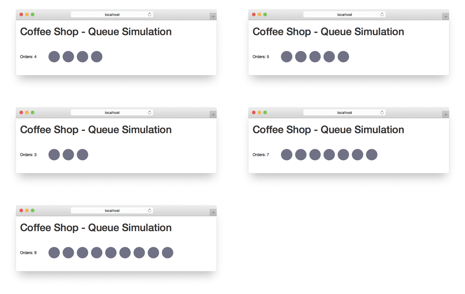
- The current order queue is stored in the variable
orders. You can access the data in the functionupdateVisualization(). The function is called automatically by our script every few seconds. - Implement the D3 update pattern and make sure to append new elements for new orders and delete elements after orders are processed (default key function; map by index).
- The design decisions are up to you but please choose appropriate circle radii and spacings.
- The SVG text label should be updated too. Don’t append a new label every time the queue changes, just update the text. (Hint: Create the label once, but update it every time
updateVisualizationis called.)
- The current order queue is stored in the variable
-
Change the circle color
You should use two different fill colors depending on the drink ordered: coffee or tea. Then, if the queue is long enough, you can see that it follows the priority principle: first-come, first-serve (i.e., first in, first out or FIFO).
Note: Right now the visualization is still slightly confusing: The queue gets filled from the right, and emptied from the left. However, since there is no transition or animation when new elements come in or are removed, it is very difficult to grasp what is going on. We will cover transitions later in the lab!
Now you should be more comfortable with the D3 update pattern. You can easily adapt the enter, update, exit sequence for any other visualizations. Using the D3 enter-update-exit pattern, code is more flexible and can accomodate changing data as well as different sized datasets.
JS Array method: map()
Up to this point, we have seen a few different array functions. In this lab you will get more practice with the popular map() method.
→ The map() method creates a new array by calling a function on every element in an existing array.
Example 1:
// Multiply each element by 10
var numericData = [1, 2, 3];
var numericDataMultiplied = numericData.map( function(d) { return d * 10; } );
numericDataMultiplied	 // Returns: [10, 20, 30]
Example 2:
// Define the callback function.
function areaOfCircle(radius) {
    var area = Math.PI * (radius * radius);
    return area.toFixed(0);
}

// Create an array
var radii = [10, 20, 30];

// Get the areas from the radii
var areas = radii.map(areaOfCircle);

areas	 // Returns: [314, 1257, 2827]
Example 3:
// Caffeine (mg) per 100g
var data = [
	{ "item": "Brewed Coffee", "caffeine": 72 },
	{ "item": "Brewed Tea", "caffeine": 36 },
	{ "item": "Coke", "caffeine": 30 },
	{ "item": "Red Bull", "caffeine": 77 }
];

// Create ordinal scale
var x = d3.scaleOrdinal();

// Use map() to compute the data for an ordinal scale automatically
x.domain(data.map(function(d) { return d.item; }));

x.domain()	 // Returns: ["Brewed Coffee", "Brewed Tea", "Coke", "Red Bull"]
Before you start with the next activity, here are a few pointers for updating scales and axes.
Updating scales and axes
Whenever you get new data or your existing data change, you need to recalibrate your scales, otherwise elements will get clipped, or the visualization will show the wrong information.
Last week you learned to create a basic linear scale like this:
var y = d3.scaleLinear()
	.domain([0, d3.max(data, function(d) { return d.price })])
	.range([0, height]);
When the data changes, the range does not have to be updated, because the visual size of your chart usually does not change. You do need to update the domain, though, because the minimum and maximum of the data might change.
// Initialize the axis once
var y = d3.scaleLinear()
	.range([0, height]);

function update(data) {
	// Update the scale's input domain to match the new data
	y.domain([0, d3.max(data, function(d) { return d.price })]);

	// Update visualization
	...
}
We can use a similar principle for updating axes.
First we have to initialize the axis function and pass in the scale function:
var yAxis = d3.axisLeft()
    .scale(y);
And then we append a group element to the SVG drawing area:
var yAxisGroup = svg.append("g")
    .attr("class", "y-axis axis");
In comparison to last week (without using the update pattern) we don’t call the y-axis function immediately. We select the group and call the axis function afterwards, every time the data change.
function update(data) {
	// Update scales and visual elements
	...

	// Update axis by calling the axis function
	svg.select(".y-axis")
		.call(yAxis);
}
This guarantees that the axis component uses the correct scale (adjusted to match the new input domain).
Activity II
In this activity you will create an interactive bar chart showing a ranking of leading coffee house chains.
-
Download the framework
http://cs171.org/2018/assets/scripts/lab5/template2.zip
The framework is based on Bootstrap and D3. You should use it for the remainder of this lab. The template includes:
index.html- HTML structure with a headline, a select box and an empty container for your visualizationstyle.css- CSS file with a few rules for the webpage and the bar chartmain.js- JS file that should contain your visualization code. We have already started to implement the bar chart (e.g. load the CSV data) but you should integrate the enter, update, exit sequence and the interactive components.coffee-house-chains.csv- The table consists of three columns: company name, revenue in billion U.S. dollars, number of stores worldwide
-
Analyze the provided framework and the CSV data
main.js
- We have created a new SVG drawing area (using the D3 margin convention)
-
We have used an ordinal scale function for the x-axis (listing all coffee shops) and a linear scale function for the y-axis (number of stores). You don’t necessarily need an ordinal scale for a bar chart but it makes your code much cleaner. You can use the JS array method map() to set domains for ordinal scales:
x.domain(data.map(function(d) { return d.company; })); - We have separated the loading of the CSV file and the actual drawing of the bar chart. The function
loadData()reads the data and saves it in the variabledata. The functionupdateVisualization()should include all the dynamic chart elements and should be called every time something changes.
-
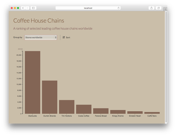
Implement the bar/column chart
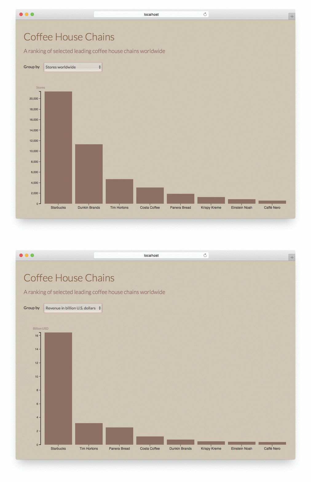
Show the coffee house chains and their number of stores worldwide. Your result should look similar to the screenshot below.
- Specify the domains for the two scales
- Consider that the data or at least the sorting of the data will change. You have to implement the enter-update-exit sequence
-
These properties will help you to position the elements:
.attr("x", function(d) { return x(d.company); }) .attr("y", function(d) { return y(d.stores); }) .attr("width", x.bandwidth()) .attr("height", function(d) { return height - y(d.stores); })bandwidth()is a particular function of d3.scaleBand that helps us to divide the space evenly and automatic into bands across a specific range. - Use the HTML class attribute
barfor the columns/bars of the chart so it matches the stylesheet. - We will draw axes for the bar chart later (see Activity II, point 6).
-
Create a ranking
Sort the coffee house chains by number of stores, and display the sorted data in the bar chart.
We provide you with the code below, but you need to decide where to best integrate it in your code:
data.sort(function(a, b) { return b.stores - a.stores; }); -
React to the user’s selection
There is a select box in the HTML document that should enable the user to switch the ranking from “number of stores” to “revenue”.
-
Listen to an event (select-box option change) with D3 or HTML/JS:
// option 1: D3 d3.select("#select-box").on("change", doSomething); // option 2: HTML <select id="select-box" onchange="doSomething()"> ... </select> -
Get the currently selected option in D3:
d3.select("#select-box").property("value"); -
Change the scales, the sorting and the dynamic properties in a way that they correspond to the selected option (stores or revenue).
Hint: You can access JS object properties either with the familiar dot notation (
product.price) or with the bracket notation (product["price"]).
-
-
Append dynamic axes
Similar to scales, you should first initialize axis components (only once) and then update them every time the data changes.
Integrate these HTML class attributes to make use of the pre-configured CSS rules:
- x-axis and axis for the x-axis
- y-axis and axis for the y-axis
You can optionally append a title for the y-axis.
Result:
Transitions
To change the color of all circles to blue, use the following D3 statement:
d3.selectAll("circle").attr("fill", "blue");
We selected all circles and changed the fill color.
D3 evaluates every attr() statement immediately, so the changes happen right away. But sometimes it is important to show the user what’s happening between the states and not just the final result. D3 provides the transition() method that makes it easy to create these smooth, animated transitions between states:
d3.selectAll("circle").transition().attr("fill", "blue");
When you add transition(), D3 interpolates between the old values and the new values, meaning it normalizes the beginning and ending values, and calculates all their in-between states.
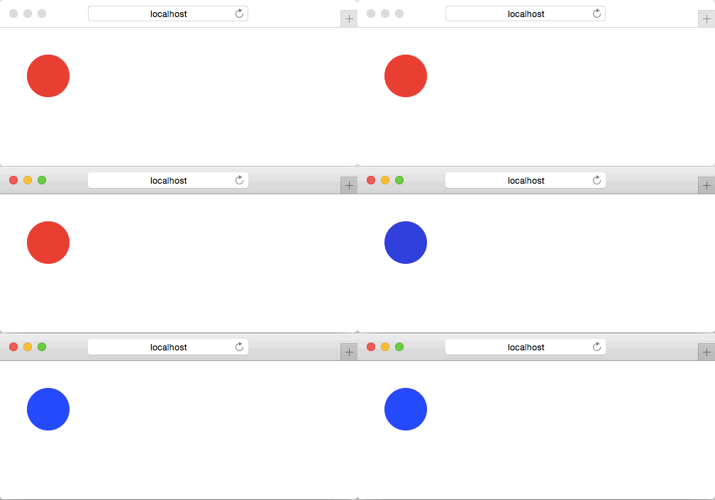
In our second example, the circle color changes from red to blue over time. The default time span is 250 milliseconds but you can specify a custom value by simply using the duration() method directly after transition().
The result shows the animation from red to blue (3 seconds):
d3.selectAll("circle")
	.transition()
	.duration(3000)
	.attr("fill", "blue");
Transitions Are Per-Element and Exclusive
“Each element transitions independently. When you create a transition from a selection, think of it as a set of transitions, one per element, rather than a single mega-transition running on multiple elements. Different elements can have different delays and duration, and even different easing and tweens. Additionally, transition events are dispatched separately for each element. When you receive an end event for a given element, its transition has ended, but other transitions may still be running on other elements.” - (Mike Bostock, http://bost.ocks.org/mike/transition/)
If you need to delay an animation, you can add the delay() method right after transition().
Animation for Visualization
If done right, animations make a visualization better and help engage the user. If done wrong (i.e., you don’t follow key principles), you will achieve exactly the opposite results.
Pros
- Transitions show what is happening between states, adding a sense of continuity and finer resolution to your visualization
- Animations can draw the user’s attention to specific elements or aspects
- Animations can provide the user with interactive feedback
Cons
- Too many transitions will confuse the user (e.g., overused PowerPoint effects)
- If the transition is not continuous, animations look funny and can even be deceiving based on the interpolation used.
- Animation across many states is the least effective use case for data analysis. In this case, use a static comparison of several charts/images (e.g., small multiples) instead of creating video-like animations.
Activity III
-
Add transitions to the bars/rectangles of your chart
Try also different time spans and examine it in the web browser.
-
Add transitions to the x- and y-axis
-
Think about the different animations. Which transitions are useful? Would it be better to omit some of them? We want you to think about the pros and cons of transitions, but you don’t have to hand anything in for this question.
Bonus Activity (optional)
In this activity you will implement a button that reverses the sort order of your bar chart.
-
HTML button to enable user interactions
The HTML snippet is already prepared. Uncomment the button in
index.html(line 31). -
Use D3 to listen to click events
d3.select("#change-sorting").on("click", function() { // do something }); -
Change the sorting
Create a boolean variable that represents the sorting state. Every time the user clicks on the button, change the state and reverse the sort order.
Generally, there are two different ways to process the new sorting:
- Call updateVisualization() every time the user clicks on the button. It will process the data-join and run through the enter-update-exit sequence
- Don’t call updateVisualization() and select the SVG rectangles directly without running through the update pattern.
In both cases you have to update the input domain of your ordinal scale and you have to call the x-axis function to redraw the axis.
-
Use a key function for the data-join and opacity during the transition
 svg.selectAll("circle")
		.style("opacity", 0.5)
 	.transition()
 	.duration(1000)
 	...
Make sure to not only lower the opacity during a transition, but to also re-set it after the transition (in another transition). Don’t forget: You can chain transitions together!
During the last activities you have probably used the default key function to bind data to the rectangles. This leads to a distorted and difficult to follow transition. As you have learned at the beginning of this lab you can add a key function (callback-function) to the
.data()property to specify a custom key, instead of an index.
Result (basic: assign keys by index):
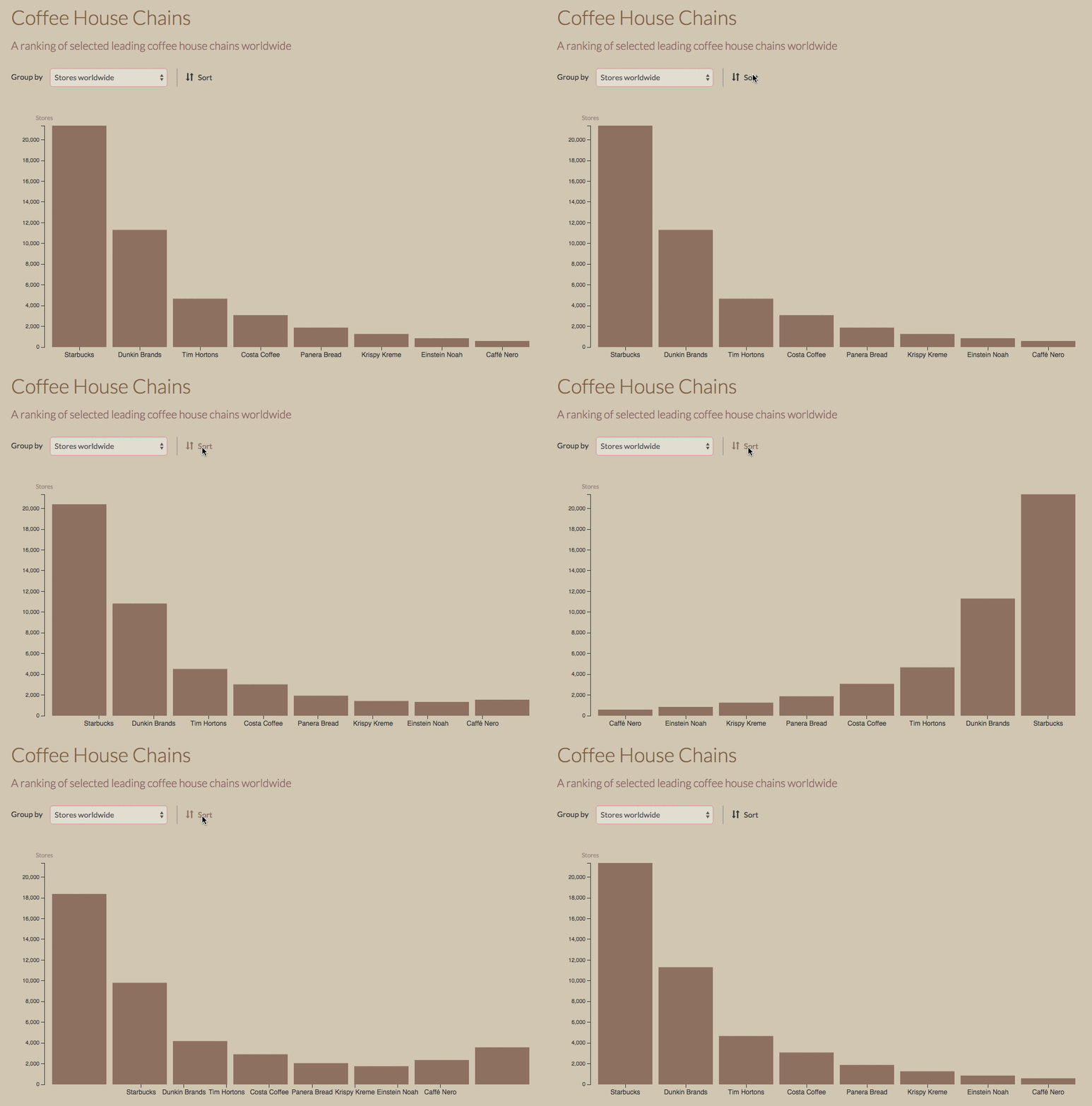
Result (advanced: custom key function):

Submission of lab (activity II, and III)
Congratulations, you have now completed the activities of Lab 5!
Please submit the code of your completed lab (the final interactive bar chart of activities II and III).
Resources
- Chapter 9 in D3 - Interactive Data Visualization for the Web by Scott Murray
- Case 1 of https://medium.com/@mbostock/what-makes-software-good-943557f8a488