
Lab 4
Pre-Reading Quiz
Please fill out the pre-reading quiz on Canvas at the beginning of class!
Learning Objectives
- Be able to differentiate between scales and axes
- Understand the concept of input domains and output ranges
- Know how to create scale functions in D3
- Know how to group and transform SVG elements
- Know how to use scales to create axes in D3
Prerequisites
- You have read and programmed along with chapter 7 and 8 in D3 - Interactive Data Visualization for the Web.
Last week you created your first D3 visualizations. You added content to the DOM, mapped datasets to visual elements on the webpage and defined dynamic, data-dependent properties. This week we will focus on Scales and Axes to create visualizations that adapt dynamically to input.
Scales
Until now, when creating a D3 visualization, we used only x and y values that corresponded directly to pixel measurements on the screen, within a pre-defined SVG drawing area. That is not very flexible and only feasible for static data. What if our data attributes are suddenly doubled? We can not increase the size of the chart every time a value increases. At some point, the user might have to scroll through a simple bar chart to get all the information.
→ This is where scales come in. We specify a fixed SVG drawing space in our webpage and scale the data to fit in the dedicated area.
D3 provides built-in methods for many different scales: linear, ordinal, logarithmic, square root etc. Most of the time you will use linear scale functions , so we will focus on learning this type of scale.
You can read more about D3 scales here: https://github.com/d3/d3-scale/blob/master/README.md
“Scales are functions that map from an input domain to an output range.” (Mike Bostock)
Example: We want to visualize the monthly sales of an ice cream store. The input data are numbers between 0 and 20,000 USD and the maximum height of the chart is 400px. We take an input inverval (called Domain) and transform it into a new output interval (called Range).
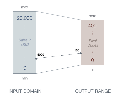
We could transform the numbers from one domain into the other manually but what if the sales rise above 20.000 and the interval changes? That means a lot of manual work. Thankfully, we can use D3’s built-in scaling methods to do this automatically.
Scaling in D3
D3 provides scale functions to convert the input domain to an output range. We can specify the domain and range by using method chaining syntax:
// Creating a scale function
var iceCreamScale = d3.scaleLinear()
	.domain([0, 20000])
	.range([0, 400]);

// Call the function and pass an input value
iceCreamScale(5000);	// Returns: 100
This was pretty easy, because we already knew the max value of the data. What if we load data from an external source and don’t know the data range the data is going to be in? Instead of specifying fixed values for the domain, we can use the convenient array functions d3.min(), d3.max() or d3.extent().
var quarterlyReport = [
	{ month: "May", sales: 6900 },
	{ month: "June", sales: 14240 },
	{ month: "July", sales: 25000 },
	{ month: "August", sales: 17500 }
];

// Returns the maximum value in a given array (= 25000)
var max = d3.max(quarterlyReport, function(d) {
	return d.sales;
});

// Returns the minimum value in a given array (= 6900)
var min = d3.min(quarterlyReport, function(d) {
	return d.sales;
});

// Returns the min. and max. value in a given array (= [6900,25000])
var extent = d3.extent(quarterlyReport, function(d) {
	return d.sales;
});
Activity I
Health & Wealth of Nations
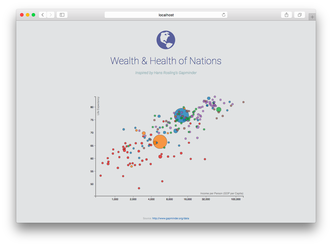
In this lab you will work on a scatterplot with flexible scales and axes. You will compare the lifetime expectancy (health) against the GDP per capita (wealth) of 188 countries. All activities in this lab are building on each other, so it is very important that you complete all tasks in order.
Result:
Data: Country |
Income |
LifeExpectancy |
Population |
Region |
-
Download the framework
http://www.cs171.org/2018/assets/scripts/lab4/template.zip
We have included Bootstrap, D3 and the dataset wealth-health-2014.csv. The HTML document contains an empty div container for the scatterplot and the CSV import is implemented in the JS file
main.js. -
Analyze and prepare the data
- Use the web console to get a better idea of the dataset (e.g. quantitative or ordinal data?)
- Convert numeric values to numbers. All the imported values are Strings and calculations with Strings will lead to errors.
-
Append a new SVG area with D3
- The ID of the target div container in the html file is
#chart-area - Use the variables
heightandwidthfor the SVG element - Save the new D3 selection in a variable (
var svg = d3.select("#chart-area")...)
- The ID of the target div container in the html file is
-
Create linear scales by using the D3 scale functions
- You will need an income scale (x-axis) and a scale function for the life expectancy (y-axis). Call them
incomeScaleandlifeExpectancyScale. - Use d3.min() and d3.max() for the input domain
- Use the variables
heightandwidthfor the output range
- You will need an income scale (x-axis) and a scale function for the life expectancy (y-axis). Call them
-
Try the scale functions
You can call the functions with example values and print the result to the web console.
 // Examples:
 incomeScale(5000) 		// Returns: 23.2763
 lifeExpectancyScale(68)	// Returns: 224.7191
Hint: If you get different return values than the ones given make sure that you are using min/max for the input domain. Also, use zero to width for the output range of the income scale. For the output range of the life expectancy scale use 0 and height. However, you want small life expectancy values to map to the bottom of the chart, and high life expectancy values to map to the top of the chart. Think about how you can do that with a scale!
-
Map the countries to SVG circles
- Use D3 to bind the data to visual elements, as you have done before (using D3’s
select(),data(),enter(),append(), etc.). Use svg circles as marks. -
Instead of setting the x- and y-values directly, you have to use your scale functions to convert the data values to pixel measures
// Ice Cream Example .attr("cx", function(d){ return iceCreamScale(d.sales); }) - Specify the circle attributes:
r,strokeandfill
- Use D3 to bind the data to visual elements, as you have done before (using D3’s
-
Refine the range of the scales
You have used the min and max values of the dataset, which means that some circles are positioned exactly on the border of the chart and are getting cut off.
You can use a padding variable when setting the range of the scales. This is one option to push the elements away from the edges of your SVG drawing area:
 var padding = 30;

 // Modify range for x-axis
 var xScale = d3.scaleLinear()
     .domain(...)
     .range([padding, width - padding]);

 // Modify range for y-axis
 var yScale = d3.scaleLinear()
     .domain(...)
     .range([height - padding, padding]);
SVG Groups
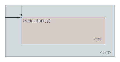
In the last lab you have learned how to create basic SVG shapes, like rectangles or circles. But there is another SVG element that is very useful for programming in D3: the group element (<g></g>). In contrast to graphical elements the group element does not have a visual presence, but it helps you to organize other elements and to apply transformations. In this way, you can create hierarchical structures.
// Create group element
var group = svg.append("g");

// Append circle to the group
var circle = group.append("circle")
	.attr("r", 4)
	.attr("fill", "blue");
Group elements are invisible but you can apply transformations, for example translate() or rotate(), to the group and it will affect the rendering of all child elements!
// Group element with 'transform' attribute
// x = 70, y = 50 (...moves the whole group 70px to the right and 50px down)
var group = svg.append("g")
	.attr("transform", "translate(70, 50)");
Axes
The current visualization does not really look like a scatterplot yet. It is just a bunch of circles that are nicely arranged. We need x- and y-axes to allow the user to actually extract meaningful insights from the visualization.
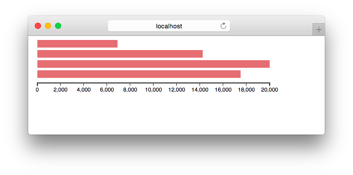
→ An axis is the visual representation of a scale.
D3 provides four methods to create axes with different orientations and label placements (d3.axisTop, d3.axisBottom, d3.axisLeft, and d3.axisRight) which can display reference lines for D3 scales automatically. These axis components contain lines, labels and ticks.
// Create a horizontal axis with labels placed below the axis
var xAxis = d3.axisBottom();

// Pass in the scale function
xAxis.scale(xScale);
The above is equivalent to:
var xAxis = d3.axisBottom()
	.scale(xScale);
Finally, to add the axis to the SVG graph, we need to specify the position in the DOM tree and then we have to call the axis function.
We create an SVG group element as a selection and use the call() function to hand it off to the xAxis function. All the axis elements are getting generated within that group.
// Draw the axis
svg.append("g")
	.attr("class", "axis x-axis")
	.call(xAxis);
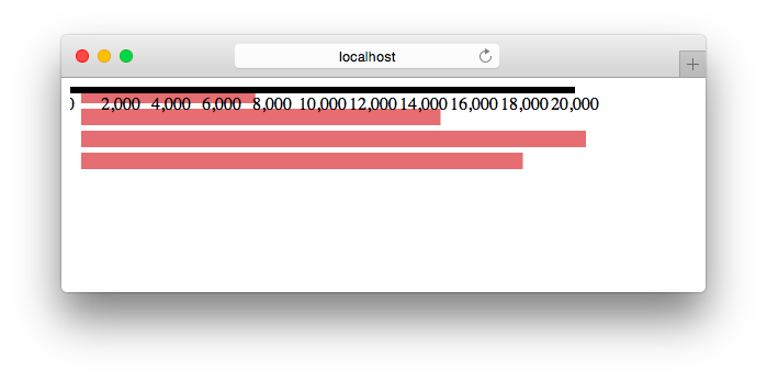
Recall that we can use the transform attribute to change the position and move the axis to the bottom.
// Draw the axis
svg.append("g")
	.attr("class", "axis x-axis")
	.attr("transform", "translate(0," + (height - padding) + ")")
	.call(xAxis);
Additionally, you can use the HTML class property as a selector and modify the style with CSS:
.axis path,
.axis line {
	fill: none;
	stroke: #333;
	shape-rendering: crispEdges;
}

.axis text {
	font-family: sans-serif;
	font-size: 11px;
}
shape-rendering is an SVG property which specifies how the SVG elements are getting rendered. We have used it in this example to make sure that we don’t get blurry axes.
Refine the axis
D3 axis functions automatically adjust the spacing and labels for a given scale and range. Depending on the data and the type of the visualization you may want to modify these settings.
var xAxis = d3.axisBottom()
	.scale(xScale)
	. ... // Add options here
There are many different options to customize axes:
- Number of ticks:
.ticks(5) - Tick format, e.g. as percentage:
.tickFormat(d3.format(".0%")) - Tick values:
.tickValues([0, 10, 20, 30, 40])
You can read more about D3 axis, ticks and tick formatting in the D3 API reference: https://github.com/d3/d3-axis/blob/master/README.md
Activity II
-
Use your scales (income and life expectancy) to create D3 axis functions
-
Append the x- and y-axis to your scatterplot
Add the axes to a group element that you add to the SVG drawing area. Change the axis (group) position with the SVG translate() property. You can use the padding variable from Activity I.
Of course, this is only one way to specify the spacing. You could also include margin variables for the whole SVG area or introduce separate padding variables for each axis. We will work with margin variables later in this lab.
-
Refine the domain of the scales
You have used the min and max values of the dataset to define the domain. The axis component creates a visual representation of this scale and therefore some of the circles are positioned on the outer edges of your svg area.
You can include buffer values to widen the domain and to prevent circles and axes from overlapping:
//Ice Cream Example .domain([ d3.min(data, function(d){ return d.sales }) - 100, d3.max(data, function(d){ return d.sales }) + 100 ]) -
Label your axes
Create titles/labels for your scatterplot axes. The label for the x-axis should be below the x-axis, the label for the y-axis should be left ot the y-axis. (For the y-axis label you will need to rotate your text by using the transform attribute.)
Keep in mind that all the axis elements are grouped together in the
gelements. Append an SVG text element and specify x and y coordinates, as well as transforms like translation or rotation that might be needed.
More about D3 Scales
Other Quantitative Scales
d3.scaleSqrt()- Square root scaled3.scalePow()- Power scaled3.scaleLog()- Logarithmic scale
Ordinal Scales
In the previous examples we have used only quantitative scales but D3 also provides methods to create ordinal scales with a discrete domain.
// Create an ordinal scale function
var xScale = d3.scaleBand()
	.domain(["May", "June", "July", "August"])
	.range([0, 400]) // D3 fits n (=4) bands within this interval
	.paddingInnder(0.05);	// Adds spacing between bands
For example, D3’s ordinal scales can be very useful to simplify the positioning of bars in a bar chart.
Color Scales
D3 has built-in color palettes that work like ordinal scales and can also be accessed like other scales:
Examples:
d3.scaleOrdinal(d3.schemeCategory10)- ordinal scale with a range of 10 categorical colorsd3.scaleOrdinal(d3.schemeCategory20)- ordinal scale with a range of 20 categorical colors
// Construct a new ordinal scale with a range of ten categorical colors
var colorPalette = d3.scaleOrdinal(d3.schemeCategory10);

// Print color range
console.log(colorPalette.range());
// ["#1f77b4", "#ff7f0e", "#2ca02c", "#d62728", "#9467bd", "#8c564b", "#e377c2", "#7f7f7f", "#bcbd22", "#17becf"]

// Specify domain (optional)
colorPalette.domain(["Vanilla", "Cookies", "Chocolate", "Pistachio"]);

// Use color palette
colorPalette("Chocolate") // Returns: #2ca02c
Instead of using a fixed range of colors you can use linear scale functions to create color gradients:
var linearColor = d3.scaleLinear()
  .domain([0,100])
  .range(["darkgreen","lightgreen"]);

linearColor(0)		// Returns: #006400
linearColor(50)		// Returns: #48a948
linearColor(100) 	// Returns: #90ee90

Activity III
-
Add a scale function for the circle radius
- Create a population-dependent linear scale function. The radius should be between 4 - 30px.
- Then use the scale function to specify a dynamic radius
-
Change the drawing order
Larger circles should not overlap or cover smaller circles. Sort the countries by population before drawing them.
-
Color the circles (countries) depending on their regions
Use a D3 color scale.
-
Logarithmic scales
You can use
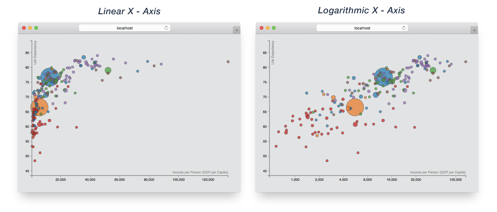
d3.scaleLog()to create logarithmic scale functions. Try it out for one or two axes and check the differences in your web browser.Be aware that log scales cannot handle zero values!
Most likely you also have to modify the axis ticks.
The D3 Margin Convention
Positioning the axes or defining the correct spacing between the components can be cumbersome. Earlier in this lab we suggested an easy solution by using a padding variable. This was convenient for our type of chart but especially for larger visualizations you should use a global margin object, with individual spacings for all directions.
By convention, margins in D3 are specified as an object with top, right, bottom and left properties. Then, the outer size of the chart area, which includes the margins, is used to compute the inner size available for graphical marks by subtracting the margins. (Mike Bostock)
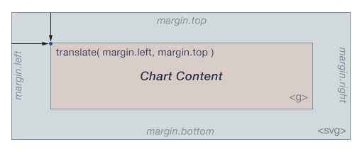
Please take some time to look at the recommended sequence by Mike Bostock:
// Margin object with properties for the four directions
var margin = {top: 20, right: 10, bottom: 20, left: 10};

// Width and height as the inner dimensions of the chart area
var width = 960 - margin.left - margin.right,
    height = 500 - margin.top - margin.bottom;

// Define 'svg' as a child-element (g) from the drawing area and include spaces
var svg = d3.select("body").append("svg")
    .attr("width", width + margin.left + margin.right)
    .attr("height", height + margin.top + margin.bottom)
    .append("g")
    .attr("transform", "translate(" + margin.left + "," + margin.top + ")");

// All subsequent functions/properties can ignore the margins:
var x = d3.scaleLinear()
	.range([0, width]);

var y = d3.scaleLinear()
    .range([height, 0]);
(Source: http://bl.ocks.org/mbostock/3019563)
Bonus Activity
Use the D3 margin convention in your scatterplot.
The code snippets above should help you to easily modify your current solution.
Submission of lab (activity I, II, and III)
Congratulations, you have now completed the activities of Lab 4!
Please upload the code of your completed lab (the final scatterplot of activities I, II, and III)!
Resources
- Chapter 7 and 8 in D3 - Interactive Data Visualization for the Web by Scott Murray
- https://github.com/d3/d3-scale/blob/master/README.md
- https://github.com/d3/d3-axis/blob/master/README.md
- https://www.dashingd3js.com/
- http://bl.ocks.org/mbostock/3019563