Homework 5
This homework requires that you have read Case 1 of the article: https://medium.com/@mbostock/what-makes-software-good-943557f8a488
Optional reading: Mike Bostock’s ‘Thinking with Joins’, and chapters 9-10 in D3 - Interactive Data Visualization for the Web.
1) FIFA World Cup™ - All Time Statistics (7 points)
The FIFA World Cup™ is the biggest single-event sporting competition in the world and is played by the senior men’s national teams from the 209 Member Associations of FIFA. The competition has been played every four years since the inaugural tournament in 1930, except in 1942 and 1946 when it was not held because of the Second World War.
The 20 FIFA World Cup tournaments have been won by eight different national teams.
FIFA (http://www.fifa.com/fifa-tournaments/statistics-and-records/worldcup)
Template
To help you get started with this homework assignment we have prepared a template that you can use. It is based on the front-end framework Bootstrap and it includes the JS libraries: D3, D3-tip (tooltips) and jQuery. Furthermore, a CSV file (fifa-world-cup.csv) is stored in the folder “data”. Of course, you can also start with an empty project and just copy the dataset.
http://www.cs171.org/2018/assets/scripts/hw5/template.zip
Overview
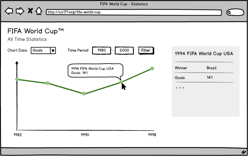
A D3 line chart will be the core component of your visualization. The x-axis represents the time period and the y-axis will show the attribute of the current user selection: goals, average goals, matches, teams or average attendance. Additional input fields allow the user to limit the time frame that is shown. If you hover over an event in the line chart, the most important attributes are displayed in a tooltip. If you click on an event, detailed information is visible in a separate container to the right of the chart.
You can use the following mockup as a guide:

Implementation
-
Download the resources
Please download the template and the CSV file as a ZIP file: http://www.cs171.org/2018/assets/scripts/hw5/template.zip
-
Familiarize yourself with the provided framework and the FIFA World Cup data
main.js
- The script creates a new SVG drawing area inside the container
#chart-area - We have separated the loading of the CSV file and the update sequence. The function
loadData()reads the data and saves it in the variabledata. The functionupdateVisualization()should include all the dynamic chart elements and should be called every time something changes. Beyond that, feel free to customize the structure according to your preferences. -
We have used the D3 time formatting function to parse string values (year the world cup was held) to date objects. You can read more about D3 time formatting here: https://github.com/d3/d3-time-format/blob/master/README.md.
If you want to convert it back - to a year value with four digits - you can use: formatDate(d.YEAR)
  var formatDate = d3.timeFormat("%Y");
  var parseDate = d3.timeFormat("%Y");

  var newDate = parseDate("2020");
  newDate  // Returns: Wed Jan 01 2020 00:00:00 GMT-0500 (EST)
  var year = formatDate(newDate);
  year 	 // Returns: "2020"
- The script creates a new SVG drawing area inside the container
-
Create scales and axis functions
- Create the inital scales and axes. Make sure to pick appropriate scales, especially for the x axis!
- Keep in mind that you should update the input domains each time the data changes.
- We recommend that you first implement the y-axis for showing the data attribute “goals”. After you have implemented the initial line chart, you will then connect your visualization with a select box to create a dynamic y-axis (in Activity II, part 6). This will allow the user to interactively change the attribute that is being visualized on the y axis.
-
Use the
d3.linefunction to map the data to an SVG path and draw the line chart- Read more about D3’s path generator: https://github.com/d3/d3-shape/blob/master/README.md#lines
- Create a path by using the d3.line function.
- Try different values for the curve property (e.g., d3.curveLinear, …) and choose a setting that fits best.
- Make sure that you can update the path with new data afterwards
- Debugging hint: Make sure you only draw a single path!
Important: Usually, in D3 you map your data elements to the same number of visual elements (e.g., circles). Here, you will map all your data elements to a single path. This is reflected in a different way to create and update your path, different to the standard enter/update/exit methods. Also, you might want to look at the difference between data and datum in D3.
-
Draw the axes
- Append the axis components to the drawing area only once
- The axis functions must be called every time the data changes
-
Emphasize the data points on the D3 line graph
- Append an SVG circle on each x/y intersection (20 tournaments = 20 circles)
- The points are meant to highlight the individual events and will be used as an anchor point for the tooltips later
- Use the D3 update pattern: enter, update, exit
-
Implement a dynamic y-axis
The user should be able to switch between different data attributes for the y-axis:
- Goals
- Average Goals
- Matches
- Teams
- Average Attendance
Create an HTML select box and react to changes in your JS code (update scale → redraw visual elements). The default value should be the number of goals. The x-axis shows the time frame and always stays the same.
Make sure that your code stays well-structured and understandable, especially after these types of modifications.
-
Include smooth, animated transitions whenever something in the visualization changes
Instead of jumping from one state to another, perform a smooth transition when the user selects a different mode (y-axis value). The duration of the transition should be 800ms.
- Add transitions to the path, the overlayed circles, and the axes
-
Implement tooltips
- The provided template contains the D3 tooltip library d3-tip (CSS and JS): https://github.com/VACLab/d3-tip
- You can use the libray or create your own tooltips
- Display the tooltip whenever the user hovers over a circle in the line chart (circle = specific world cup instance)
- The tooltip should include the edition (year, country) and the respective y-axis value, which depends on the users selection
-
Implement a time period filter
Enable the user to limit the visible FIFA World Cups to a specific time frame.
- Create two HTML input fields (lower and upper bound) and a button to update the visualization. Optionally, if you feel confident in JavaScript and were able to finish the last steps quickly, you can also implement a range slider.
- The default values should cover the whole time period of the data (20 FIFA World Cups).
- After the user modifies the time frame you have to filter the dataset, update the scales/axes and redraw the SVG elements (
updateVisualization()). - You don’t need to worry about error handling here. We expect that the user enters a valid time frame.
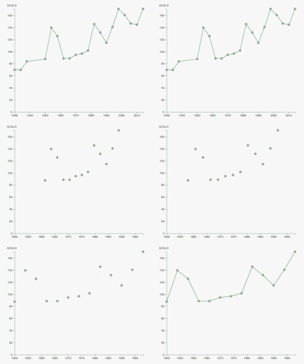
- Adjust the transition of the circles and the path in the line chart: Think about how you can best visually represent the filtering action in the transition. The transition should be intuitive and not break the mental model the user has of the data. Use the animation below as guidance.

-
Show the details for a single FIFA World Cup edition
If the user clicks on an SVG circle on the line graph, the invidual statistics for this specific event should be displayed in a separate container beside the chart.
- Extend your HTML structure to display the additional information
- Create a click listener for the SVG circles. For this you have to make sure that the tooltip you previously created does not overlap with the circle. You might have to add an offset to the tooltip to accomplish that.
- We have prepared an empty function
showEdition(d). You can call it with the data of the selected event and implement the logic there. Re-factoring code into separate functions is a crucial factor for maintaining the readability and extensibility of your programs. Your D3 update sequence remains compact and you can reuse the functions. - Use JS functions, D3 or jQuery to update the HTML content with all the available information for a FIFA World Cup edition: title, winner, goals, average goals, matches, teams, average attendance.
-
Create a proper style for your webpage
Maintain good spacing between UI components, overall layout, font size, color scheme, etc. Also, make sure that transitions are intuitive and clear.
2) Check out the IEEE Visualization Conference (3 points)
Most of the CS171 staff is at the IEEE Visualization conference in Berlin, Germany this week. IEEE Vis is the world’s largest research conference on visualization.
All technical papers had to submit 30 second preview videos, which you can find here.
Browse the selection of videos and pick your three favorites. Your favorites can include videos that impress you for their visualization, high-quality video production, interesting topic, or any other reason.
- Write a short paragraph (40-100 words) on each of the three videos, telling us why you picked them.
This assignment is meant to introduce you to the world of visualization research. Not all videos will be polished, some will tell you just the basic facts, while others will be more like an elevator pitch, trying to sell their visualization to you. Have fun exploring!
3) Bonus Task (1 point)
Please make sure to finish all previous tasks before you start with the bonus activity. Extra credits are only given if the rest of the homework has been completed and the full possible points have been received. This task is intended for those of you who have already more experience with web development and JS libraries.
Implement a range slider in your project, instead or in addition to the input fields. The user should be able to select a specific time period and the line chart should get updated automatically. If you want to explore more facets of the powerful D3 library you can try to implement the slider either with D3 or you can use another JS library, such as NoUiSlider (http://refreshless.com/nouislider/). The range of the slider should be extracted dynamically from the dataset. Please use labels or tooltips to indicate the chosen time period.
Example:

4) Submit Homework in Canvas
Submission instructions:
- Use the following recommended folder structure:
/submission_FirstnameLastname
	hw/
	    implementation/ ...folder for your code
   	        index.html
	        css/ 		...folder with all CSS files
	        js/ 		...folder with all JavaScript files
	    design/         ...folder for your sketches

	    ...
-
Make sure to keep the overall size of your submission under 5MB! Sketches don’t have to be in the highest resolution, but should still be readable.
-
Upload a single .zip file.
-
Please submit your lab separately from your HW.
Congratulations for finishing Homework 5! See you in class!