Homework 3
This homework assumes that you have read and programmed along with chapter 3 (p. 53-62) and chapter 5 in D3 - Interactive Data Visualization for the Web.
1) The World’s Tallest Buildings (7 points)
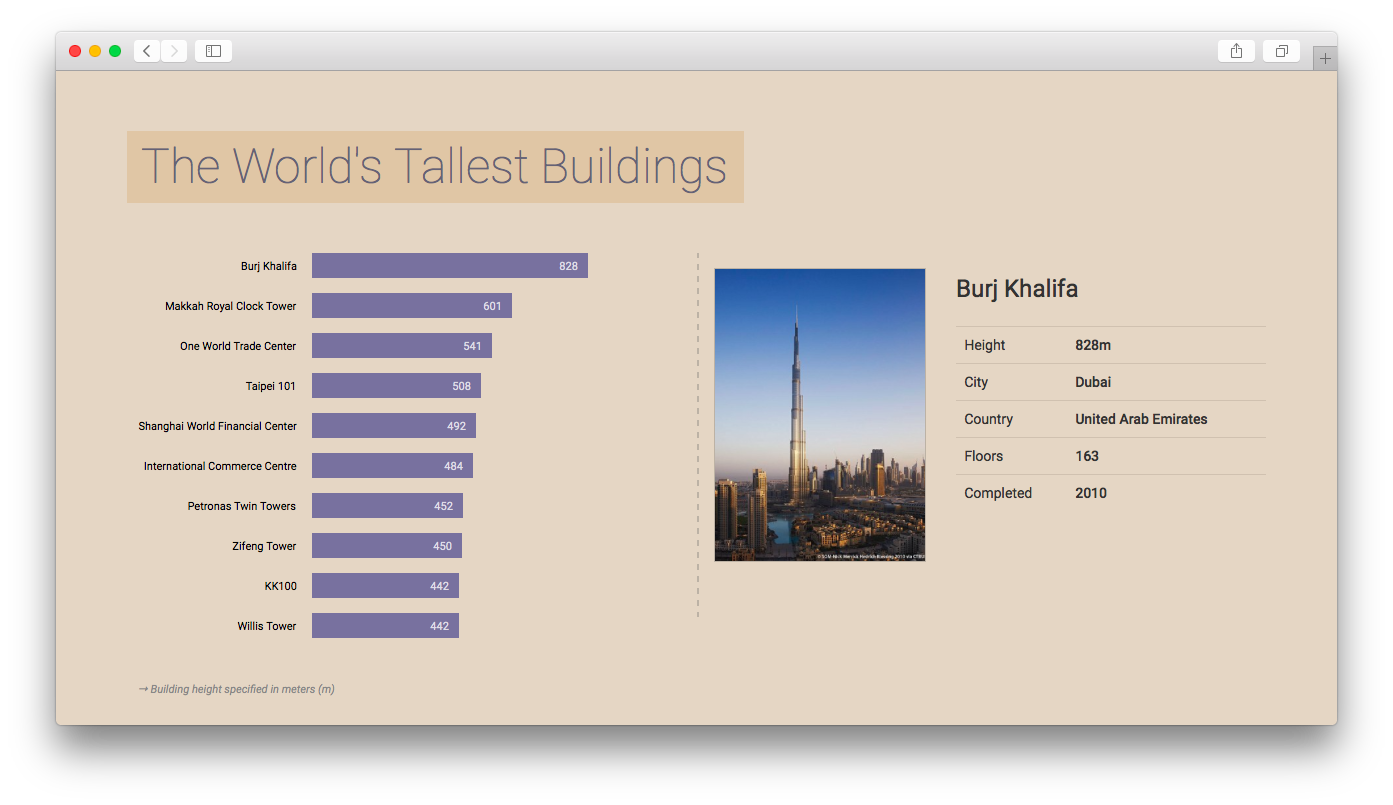
In this homework you will implement a horizontal bar chart with D3. Your bar chart will represent the ten tallest, fully-completed buildings in the world. Users will be able to click on a bar or label on the chart to get more information about a specific building.
During development you can base your work on the following screenshot, but the design decisions (colors, fonts, …) are principally up to you:

Data
We have provided a dataset with the world’s tallest buildings. The CSV file (buildings.csv) includes a header row, which should help you to identify the different values, and a list of ten buildings.
The img folder contains an image in portrait format for each building.
Implementation
-
Download the resources
Please download the CSV data and the images as a ZIP file: http://www.cs171.org/2018/assets/scripts/hw3/data7238.zip
-
Set up a new D3 project and load the CSV file
-
Create a multi-column layout (HTML/CSS)
Split your page into multiple columns. The bar chart will be placed on the left side of the page while the right side will consist of a container that displays the dynamic content when the user selects a building in the bar chart. You can use the Bootstrap grid system (getbootstrap.com/css/#grid).
-
Draw the SVG bar chart with D3
- Create a drawing area with at least 500 x 500px
- Bind the loaded data to SVG rectangles (and place them correctly)
- The bars should be left-aligned
- Similar to Lab 3, the different heights are given in pixels, so you don’t have to use dynamic scales (data column:
height_px)
-
Add labels for building names and height measures to the bar chart
- The building names should be placed left of the bar chart and be right aligned (use the SVG text property
text-anchor: end). That means that you will have to shift your rectangles to the right, to avoid overlapping of text and rectangles. (Take a look at our example screenshot above to see how it should look.) - The labels for the building heights should be displayed inside the rectangles, at the right end of the bars.
- Use proper font colors and sizes
Note: If you are using the same HTML tags for different selections you have to work with class attributes:
 svg.selectAll("span.firstName")
     .data(data)
 	.enter()
 	.append("span")
 	.attr("class", "firstName")
     ...

 svg.selectAll("span.age")
     .data(data)
 	.enter()
 	.append("span")
 	.attr("class", "age")
     ...
We generally recommend that you use class attributes, and to add styling rules - which should affect the whole selection - to your external stylesheet.
- The building names should be placed left of the bar chart and be right aligned (use the SVG text property
-
Sort the buildings in descending order by height
Include your sorting algorithm directly after loading the data.
-
Make it interactive
After selecting a specific building by clicking on the SVG labels or bars, more detailed information should be presented to the user.
You will have to use D3 event listeners to solve this task. There are different types of mouse events (e.g.
mousedown,mouseup,click,dblclick…) available. They can be assigned to each element of a selection, by adding theon-operator:.on("click", function(d) { // Do something after click });You can learn more about event listeners for selections here: https://github.com/d3/d3-selection/blob/master/README.md#handling-events
- Assign click event listeners to the bars and building names
- Get the currently selected object (building) and display the building name as a headline in the right panel of your HTML document. Use D3, jQuery or plain JavaScript methods to update the DOM tree.
- Show additional information: height, city, country, floors and year of completion. The data should be presented in a clear manner (e.g. as an html table).
- Display the corresponding image. All the files are stored in the img folder. The
imagecolumn in the data indicates the actual filename. - Bonus (not mandatory!): Come up with a way to indicate that the bars and text labels are clickable.
-
Use good programming practices to structure your code
This is a good point to take a couple of minutes to think about your code. Is everything clear, well structured, and documented? Oftentimes moving a block of code into its own separate function goes a long way toward improving readability! Your code should be concise and easy to read. That not only reduces debugging time, but will allow you to understand your code when you come back to it in a couple of months. Be kind to your future self!
- Identify code that can easily be re-factored into separate functions. E.g. click event listeners for the rectangles and text currently behave the same way. That means you should probably have a single function that is called when clicking either on a rectangle or a building name.
- Document all your functions, and make note of important points in the code. However, don’t go overboard by documenting every line of code.
- Use speaking variable names. Avoid using names like
var temp_dor.div3. Rather use names likevar sorted_buildingsor.barchart.
-
Use CSS to design the webpage
Take care of an adequate spacing between your elements.
We have used the Google Font “Roboto” in our example. If you are interested in using different fonts, this page might be helpful: https://www.google.com/fonts
2) Design Critique & Re-Design (3 points)
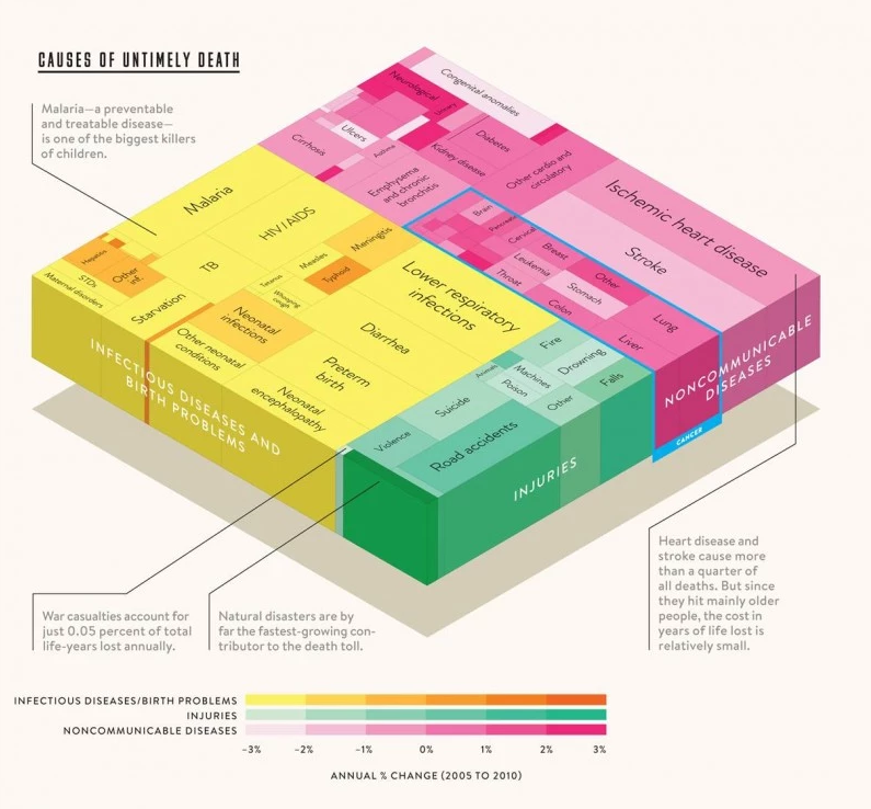
Visualization: Causes of Untimely Death
“If sorrow were a landscape, here’s how it would look from a cruising altitude of 30,000 feet. This graphic maps the global cost of early mortality—some 1.7 billion years of human life forfeited annually—sorted by cause of death.” — Wired
 By Thomas Porostocky | Source: Institute for Health Metrics and Evaluation (http://www.washingtonpost.com/blogs/wonkblog/files/2013/12/image001-800x742.jpg)
From the Washington Post:
“For 2013, we asked some of the year’s most interesting, important and influential thinkers to name their favorite graph of the year — and why they chose it.”
Bill gates writes about this visualization:
“I love this graph because it shows that while the number of people dying from communicable diseases is still far too high, those numbers continue to come down. In fact, fewer kids are dying, more kids are going to school and more diseases are on their way to being eliminated. But there remains much to do to cut down the deaths in that yellow block even more dramatically. We have the solutions. But we need to keep up the support where they’re being deployed, and pressure to get them into places where they’re desperately needed.”
Please answer the following questions for the visualization above:
-
Who is the audience?
- Which questions does this visualization answer? Name at least three.
- What data is represented in the visualization? Be specific and comprehensive.
- For each data type, describe how it is encoded in the visualization using Bertin’s marks and channels. E.g. color saturation (channel) encodes annual percentage of change between 2005 and 2010.
- How are the perceptual channels contrast and color used in the visualization? Name at least two potential problems.
- How are Tufte’s design principles used or violated in this chart?
!! You will have to submit your design critique as a PDF document.
Re-Design
-
Sketch multiple re-designs of the visualization. The re-designs should address the three questions you identified previously (in question 2 from the previous step) more effectively.
Do not worry about the specifics of the data or the quality of your sketches! Sketch and submit at least 3-4 designs.
!! Scan your sketches and create a PDF file with all results.
-
Pick one of your sketches that you think answers one or more specific questions most effectively and answer these questions for your chosen sketch:
- For each data type, describe how it is encoded in your redesign using Bertin’s marks and channels.
- How are the perceptual channels contrast and color used in your chosen sketch?
- How are Tufte’s design principles used or violated in your sketch?
!! Create an additional PDF file with the answers.
3) Bonus Task (1 point)
Please make sure to finish all previous tasks before you start with the bonus activity. Extra credit is only given if the rest of the homework has been completed and the full possible points have been received. This task is intended for those of you who already have more experience with HTML, CSS and JS.
When the user clicks on a bar or on a text label you are currently displaying, additional information about the selected building in the right column should appear. Include a link below the table that leads to the building’s Wikipedia page. The URLs should be generated automatically from your data and the page should open in a new browser tab.
4) Submit Homework in Canvas
Submission instructions:
- Use the following recommended folder structure:
/submission_FirstnameLastname
	hw/
	    implementation/ ...folder for your code
   	        index.html
	        css/ 		...folder with all CSS files
	        js/ 		...folder with all JavaScript files
	    design/         ...folder for your sketches
	        ...
	lab/
	    ...
-
Make sure to keep the overall size of your submission under 5MB! Sketches don’t have to be in the highest resolution, but should still be readable.
-
Upload a single .zip file.
-
Also submit the completed lab on Canvas.
Congratulations for finishing Homework 3! See you in class!